
NATIONAL ASBESTOS HELPLINE EDITORIAL COPIES
NATIONAL ASBESTOS HELPLINE EDITORIAL COPIES
INTRODUCTION TO BRIEF
The brief for this project was to create an editorial press advertisement for the National Asbestos Helpline, aimed at raising awareness about the dangers of asbestos exposure among both homeowners and workers. The campaign needed to communicate, with clarity and urgency, how asbestos can affect people’s health, using verified figures and statistics to inform readers of the risks and long‑term consequences. A key part of the brief was to guide individuals who believe they may have been exposed, explaining how they could be entitled to compensation and directing them toward the Helpline’s free guide books for further support. The advert required a strong, accessible call‑to‑action, encouraging readers to seek advice, understand their rights, and take the next steps toward receiving help. The overall aim was to deliver an editorial page that was informative, trustworthy and sensitive to the subject matter, while effectively driving engagement from those who may need assistance.
BRIEFING THE PROBLEM
This project required addressing several sensitive challenges that shaped both the tone and structure of the editorial copies. The primary obstacle was ensuring the content remained informative and grounded in hard‑hitting truths without becoming overly negative or distressing. Asbestos is a serious and often life‑altering issue, but the copy needed to feel helpful, supportive and action‑focused, guiding readers toward understanding their rights rather than overwhelming them with fear.
Another key challenge was striking the right balance between seriousness and readability. The ads had to communicate the gravity of asbestos exposure, yet still attract attention and encourage engagement. This meant avoiding dense, clinical language and instead using clear, accessible messaging supported by factual statistics that reinforced credibility without exaggeration. Every figure included needed to be accurate, verified and responsibly presented, ensuring the campaign maintained trust and avoided sensationalism.
Ultimately, the problem to solve was how to deliver a message that was urgent but not alarmist, informative but not morbid, and serious but still approachable, creating editorial pages that empowered readers to seek help, understand their options and take meaningful next steps if they believed they had been affected by asbestos.
PROCESS AND TOOLS
I produced the National Asbestos Helpline editorial page in Adobe InDesign, developing a layout that balanced clarity, seriousness and accessibility. Working closely with both my director and the client team, I refined the copy to ensure it told the full story of asbestos exposure with accuracy and empathy. This collaboration was essential for gathering verified figures and statistics, shaping the narrative around factual information rather than speculation, and ensuring every detail aligned with the organisation’s guidance and legal responsibilities.
The visual approach was carefully considered. We established early on that a predominantly black colour scheme made the most sense - it conveyed seriousness, respect for the subject matter and a sense of urgency without feeling sensationalist. To complement this, I introduced accents of orange, drawing on its association with construction, hazard awareness and industrial environments. This subtle use of colour helped attract the attention of workers who may have been exposed on job sites, while still maintaining a clean, professional editorial tone.
Imagery played a crucial role in supporting the message. I incorporated relevant photographs, diagrams and icons that helped break up dense information and make the content more approachable. Because the brief required a significant amount of statistics, guidance and visual elements, the challenge was to include everything without overwhelming the reader. This meant carefully structuring the layout, refining hierarchy, and ensuring every element had enough breathing room to remain clear and digestible.
The final process was highly iterative, balancing factual content, emotional sensitivity and visual clarity, resulting in an editorial page that was informative, trustworthy and visually organised.
OUTCOME
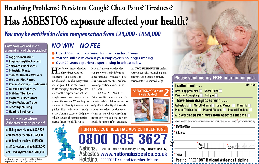
The final editorial page delivered a clear, structured and impactful message that helped readers understand both the dangers of asbestos exposure and the practical steps they could take if they believed they were affected. The copy presented verified statistics, real‑world context and supportive guidance, all anchored by a strong call‑to‑action that directed readers toward the National Asbestos Helpline for further help.

Full Page
Half Page
A dedicated response code was featured prominently throughout the layout, placed within the body copy, highlighted in call‑out sections, and included on the printed coupon. This ensured that every reader, regardless of how they preferred to respond, had an immediate and accessible way to order the free guide books. These guides provided deeper information on symptoms, legal rights and compensation pathways, making the editorial page not just informative but genuinely actionable.
The visual hierarchy and colour strategy reinforced clarity and seriousness, helping the message stand out without feeling alarmist. By combining factual content, approachable language and multiple response mechanisms, the final copy encouraged readers to take meaningful next steps. As a result, awareness increased significantly, with more individuals reaching out, requesting guides and taking action to understand their rights.
