
FUN HOUSE BRANDING
INTRODUCTION TO BRIEF
This project formed my negotiated major project at university, with a brief that aligned perfectly with my interests in cartoon illustration, packaging design and all things confectionary. The aim was to create a full branding and packaging system for Fun House, a playful confectionary brand inspired by the energy, nostalgia and visual spectacle of fun fairs. The deliverables included packaging for a chocolate bar, a popcorn bag, a milkshake bottle label and an ice cream tub, each needing to feel bright, inviting and bursting with personality.
The theme centred on fun‑fair food culture, but with a modern, flavour‑forward twist. The branding had to capture the excitement of discovering sweet treats at a carnival while appealing to contemporary tastes through bold colours, expressive illustrations and a cohesive visual identity. The brief encouraged a lively, character‑driven approach that celebrated indulgence, imagination and the joy of confectionary, allowing me to merge my illustration style with a fully realised packaging world.
BRIEFING THE PROBLEM
The Fun House brief came with a set of challenges that shaped how the branding needed to be developed. The first was creating a genuinely inspired, character‑driven confectionary brand - something that felt imaginative and playful without slipping into anything overly childish. The products needed to appeal to people who enjoy sweet treats, not just kids, so the visuals had to communicate quality, confidence and a sense of modern fun. That meant building a world that was bright and inviting, but still polished enough to stand out as a considered piece of packaging design rather than novelty.
Another challenge was making sure the branding fully embodied the fun‑fair theme. The brief called for packaging that mimicked the excitement, colour and indulgence of classic fairground food, but with contemporary flavour twists. Achieving this required careful use of cartoon illustration, expressive characters and bold palettes that captured the energy of a carnival without feeling chaotic or overwhelming.
Finally, the products needed to stand out in a crowded confectionary market. With so many brands competing for attention, the Fun House range had to be instantly recognisable, visually cohesive and full of personality. The challenge was to create packaging that would catch the eye on a shelf, communicate flavour quickly and feel like part of a larger, joyful brand universe.
RESEARCH
As I developed the Fun House branding concept, a major part of my research involved diving into 1980s and 1990s chocolate packaging, which became a huge inspiration point for the project. This era of confectionary design is packed with the exact qualities Fun House needed: bold type, high‑energy colour palettes, and an unapologetically inviting visual style that makes every product feel like a treat before you’ve even tasted it.
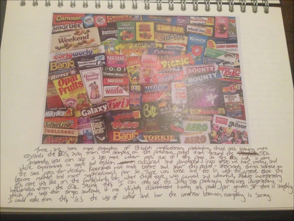
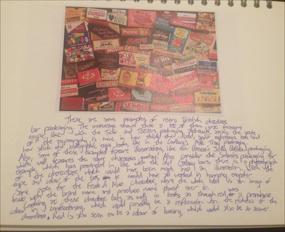
As I developed the Fun House branding concept, a major part of my research involved diving into 1980s and 1990s chocolate packaging, which became a huge inspiration point for the project. This era of confectionary design is packed with the exact qualities Fun House needed: bold type, high‑energy colour palettes, and an unapologetically inviting visual style that makes every product feel like a treat before you’ve even tasted it.
Looking at chocolate wrappers from the 80s and 90s revealed a design language built around maximalism and personality. Brands weren’t afraid of saturated colours, chunky lettering, playful mascots and dynamic patterns. Everything was designed to jump off the shelf - a perfect match for the fun‑fair theme I wanted to capture. The era’s use of bright primaries, neon accents and oversized typography helped me understand how to make packaging feel exciting, youthful and flavour‑forward without losing clarity or quality.
This research also highlighted how nostalgic design can still feel modern when handled thoughtfully. The expressive palettes and bold type choices from these decades informed the tone of Fun House, helping me craft packaging that feels retro‑inspired but contemporary, and instantly inviting to anyone who loves a sweet treat.


To explore how brand mascots could shape the personality of the Fun House branding project, I looked closely at Kellogg’s cereal packaging, which has long been one of the strongest examples of character‑driven branding in the food industry. Kellogg’s mascots, from Tony the Tiger to Snap, Crackle and Pop, are designed to be instantly recognisable, friendly and full of energy, making them perfect case studies for understanding how illustration can bring a product to life.
Studying these cereals helped me break down what makes their mascots so distinctive: expressive poses, bold outlines, vibrant colours and personalities that match the flavour or theme of the product. Beyond the packaging itself, I also examined how Kellogg’s extends these characters into advertising, merchandise and promotional campaigns, showing how a mascot can evolve into a full brand ecosystem. This opened up opportunities for Fun House, and once the main characters were designed, I could imagine how they might appear across future products, limited‑edition flavours or even collectible items.
This research reinforced how powerful mascots can be in creating a memorable, playful identity, and helped me understand how to build characters that feel fun, inviting and full of flavour - perfect for a confectionary brand inspired by fun fairs and cartoon‑driven visuals.
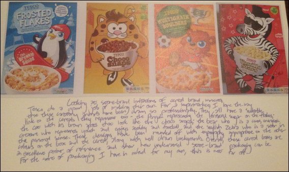
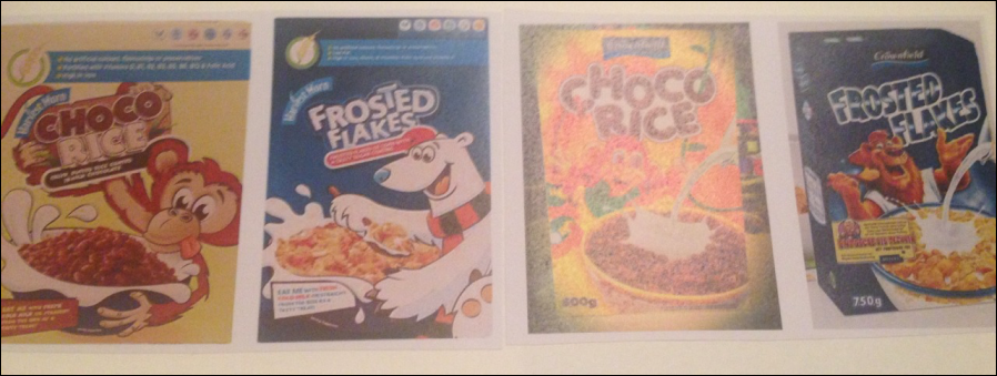
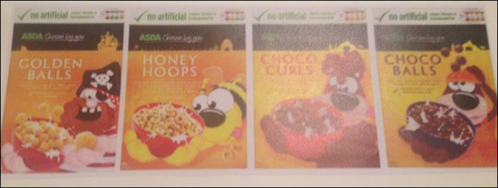
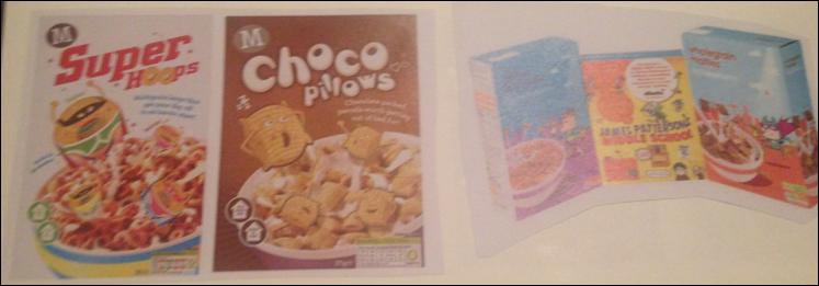
To build on my exploration of cereal mascots from major brands, I also looked closely at how UK supermarket own‑brand cereals (Tesco, Asda, Morrisons, Sainsbury’s and Aldi) approach character‑driven packaging. These store‑brand imitations became a surprisingly rich source of inspiration for the Fun House branding project, especially in understanding how mascots can be reinvented in fresh, distinctive ways even when they’re clearly referencing well‑known products.
What stood out most was how Tesco’s mascots are designed with a unique charm that sets them apart from the leading brands they imitate. The animals they use are different, the illustration style is more contemporary, and the characters often feel more stylised or quirky. Combined with complimentary colour schemes and bold typefaces, these mascots manage to stand out on shelves despite being exclusive to the store. They prove that even budget‑friendly products can have strong, memorable branding when the characters are thoughtfully designed.
Looking across other supermarkets revealed similar patterns: each store brand uses mascots not just as decoration, but as a way to inject personality, approachability and fun into their packaging. This helped me understand how mascots can be adapted, exaggerated or reimagined to suit different flavour profiles or product types - a valuable insight when thinking about how Fun House characters could evolve beyond the core range. It also opened up ideas around future merchandise, limited‑edition flavours or seasonal variations, all driven by expressive, character‑led design.


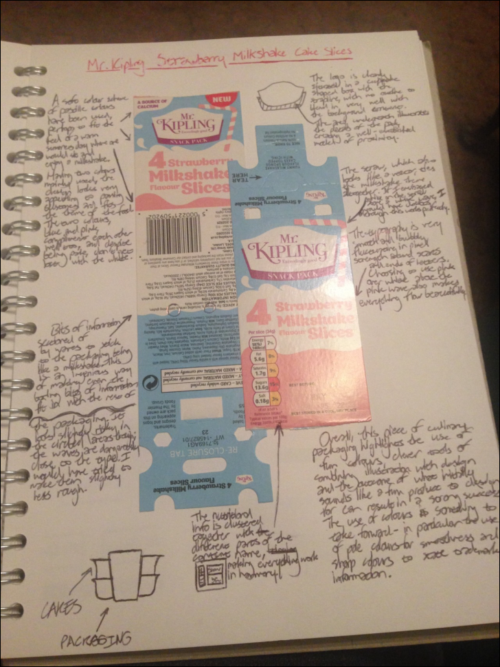


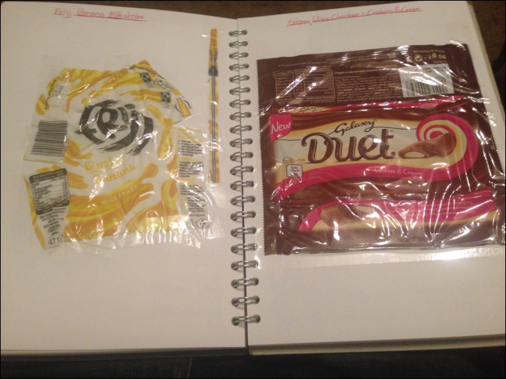
To deepen the visual direction for the Fun House branding project, I expanded my research into physical food packaging, focusing on products that use illustration, shape and layout in clever, expressive ways. What stood out across these examples was how effective packaging often goes far beyond simply displaying a logo and product name - it uses visual storytelling, texture and form to make the product feel exciting before it’s even opened.
One example that became particularly influential was Galaxy Duet. Despite using only three colours across the entire wrapper, the packaging feels rich and dynamic because of the grooves, spirals and flowing shapes that echo the product’s name. This showed how powerful shaping can be in creating movement and personality, even within a limited palette. It reinforced the idea that Fun House’s packaging didn’t need to rely on overly complex colour schemes; instead, it could use bold shapes and expressive illustration to create impact.
I also studied Frijj and Yazoo milkshakes, which face the challenge of designing for small, curved bottles. Their solution, making the logo the dominant element and weaving illustrations around it, demonstrated how typography and imagery can be twisted, wrapped and morphed together to fit unconventional formats. This was a useful reference for Fun House’s milkshake bottle label, showing how to maintain clarity while still embracing playful, energetic visuals.
Another standout was Propercorn, which uses hand‑drawn illustrations that directly relate to the flavour - such as a boat on the sea for a seaside‑inspired variety. This approach highlighted how flavour‑specific storytelling can make packaging feel more personal and imaginative. It aligned perfectly with Fun House’s goal of creating a character‑driven, flavour‑forward brand world where each product feels like its own mini attraction.
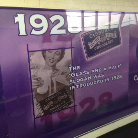

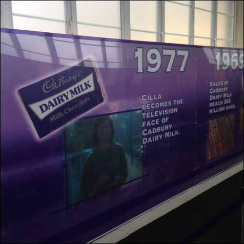


One of the most enjoyable and insightful parts of the Fun House branding research stage was a self‑planned visit to Cadbury World, where I could study real confectionary branding in a physical, immersive environment. Seeing the evolution of Dairy Milk packaging up close was especially valuable. The exhibition showcased how the design began as a simple printed wrapper and gradually transformed over the decades, adapting to new trends while still retaining the core elements that make it unmistakably Cadbury.
What stood out most was how the packaging became smoother, more colourful and more refined over time, yet the typography remained consistent. The bold, serifed typeface, always rendered in Cadbury’s iconic purple, acted as a visual anchor throughout the brand’s history. This consistency demonstrated how a strong typographic identity can carry a brand through decades of change without losing recognisability.
The exhibition also highlighted how Dairy Milk functions as Cadbury’s flagship product. Its evolution reflects not just the brand’s journey, but the broader shifts in confectionary design trends: from minimal early wrappers to more expressive, contemporary layouts. Seeing how the brand adapted while staying true to its heritage reinforced the importance of balancing nostalgia and modernity, a principle that fed directly into the Fun House project.
This visit became a key inspiration point, showing how long‑standing brands evolve visually while maintaining a clear identity - exactly the kind of approach needed to build a fun‑fair‑inspired confectionary brand with staying power.
PROCESS AND TOOLS
Throughout the Fun House branding project, the process was shaped by continuous collaboration, hands‑on experimentation and a mix of traditional and digital techniques. I liaised regularly with my tutor and peers, using their feedback to refine ideas, push the character designs further and ensure the overall brand direction stayed cohesive and energetic.
The early stages centred on hand‑drafted concepts, where I sketched out initial logo ideas, packaging layouts and character personalities. Drawing the mascots by hand allowed me to explore expressive poses, exaggerated features and playful shapes that matched the fun‑fair theme. These sketches became the foundation for the brand’s visual identity, giving the characters a lively, cartoon‑driven charm before moving into digital refinement.
For the digital production stage, I used a combination of Illustrator and Photoshop. The logo was created in Illustrator to achieve clean, scalable vector shapes and bold, confident typography that would hold up across multiple packaging formats. Photoshop became the main tool for building the packaging designs, where I combined hand‑drawn elements with digital brushes, textures and colour treatments. Using Photoshop brushes helped me create dynamic backgrounds, flavour cues and energetic patterns that tied the whole brand together.
This blend of traditional illustration and digital design ensured the final identity felt handcrafted yet polished - a vibrant, character‑led brand world that captured the playful spirit of Fun House while showcasing strong technical skills across layout, illustration and digital production.
DEVELOPMENT
I began developing the Fun House concept by returning to the research I’d gathered - everything from 80s/90s chocolate packaging to cereal mascots and expressive food‑packaging illustration. This research wasn’t just inspirational; it acted as a practical guide for how I wanted the brand to feel: energetic, nostalgic, character‑driven and bursting with flavour. Using these references, I started shaping the visual direction and personality of Fun House, deciding how the brand would communicate its fun‑fair theme through colour, illustration and layout.


The development of the Fun House brand began long before any characters were drawn or packaging was designed. I started by building a solid foundation for the brand’s identity, using a structured approach inspired by a branding‑identity book. One of the first tasks was creating a detailed list of naming strategies - not just functional names that describe what the brand does, but names with personality, rhythm and memorability. I wanted a name that felt right, one that had the same intuitive “this fits” quality as naming a child. It needed to sound playful, energetic and instantly connected to the fun‑fair theme without being too literal or restrictive.
To keep myself organised, I created an introductory page in my sketchbook for the negotiated project. This page acted as a central hub for everything I needed to consider while constructing the brand: the product range, the flavour profiles, the tone of voice, the visual direction, and the processes required to bring each element to life. Having all this information laid out clearly helped ensure that every design decision stayed relevant to the products, whether I was sketching mascots, refining the logo or experimenting with packaging layouts.

To begin shaping the Fun House brand, I focused first on developing a name that truly captured the spirit of the project. Using the fun‑fair theme as a foundation, I returned to the list of naming attributes I had gathered from my branding‑identity research book. This list helped me think beyond literal or descriptive names and instead consider qualities like rhythm, memorability, personality and emotional tone. I wanted a name that didn’t just describe the brand, but one that felt right - something playful, energetic and instantly evocative of the colourful, cartoon‑driven world I was building.
I used these attributes to brainstorm a wide range of ideas, exploring how different words connected to fun fairs, confectionary, excitement and character‑led storytelling. This stage was less about finding the perfect name immediately and more about generating possibilities, testing how each one sounded, and imagining how it might look on packaging or interact with mascots. The naming process became a creative exercise in itself, almost like naming a character or a child - it needed personality, charm and longevity.
Alongside this, I continued noting down additional key attributes of brand identity from the same book. These included tone of voice, visual consistency, emotional resonance and how a brand communicates its values through design. Keeping these principles in mind ensured that the name I eventually chose would align with the wider identity I was constructing, from colour palettes and illustration styles to packaging layouts and mascot behaviour.

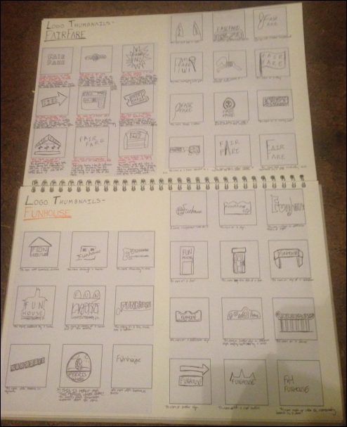

To begin shaping the Fun House logo, I worked through a structured and exploratory process that grew directly from the brand‑naming stage. Using the name ideas I had generated in earlier sketchbook pages, I created a full set of thumbnail sketches to test how each name could behave visually. Because the brand needed to feel energetic, playful and rooted in fun‑fair nostalgia, I wanted to explore as many directions as possible before committing to a final route.
I produced 21 thumbnail sketches for each of the six name options - 126 sketches in total. Each one explored a different angle: some leaned into the conceptual meaning of the name, some focused on how the word sounded when spoken, and others referenced familiar branding structures used by confectionary and entertainment brands. This helped me understand not just how the names looked, but how they felt when translated into visual form.
Many of the sketches centred around typographic experimentation, especially for names like Fun House, where the letter F offered a strong starting point for playful shaping, exaggerated serifs or carnival‑inspired flourishes. I explored how the formation of the word could become part of the logo itself - stretching letters, stacking them, bending them, or integrating them with illustrative elements.


After completing the thumbnail stage, I moved into developing the strongest logo concepts, refining them into clearer, more intentional designs. I revisited the highlights from the 126 thumbnails, identifying which sketches had the best balance of personality, legibility and alignment with the Fun House brand. From there, I began adjusting and evolving each chosen route, changing elements that didn’t work and sharpening those that showed potential once cleaned up.
This stage was all about clarity and refinement. Many of the thumbnail ideas were expressive but rough, so I focused on improving structure, strengthening letterforms and simplifying shapes where needed. Some concepts relied heavily on funfair‑inspired motifs, while others leaned more into typographic playfulness, and refining them helped reveal which direction communicated the brand’s energy most effectively.
I also tested how each logo behaved when scaled, imagining how it would appear on the chocolate bar, popcorn bag, milkshake bottle and ice‑cream tub. This helped me understand which designs were visually strong enough to anchor the entire identity. By the end of this stage, I had a clear sense of which logo captured the spirit of Fun House: bold, joyful, character‑driven and instantly inviting.


When I moved into choosing the typography for the Fun House logo, I treated it as a crucial part of defining the brand’s personality. I explored a wide range of typefaces, but I focused mainly on bold, serifed fonts that could be morphed and exaggerated into something reminiscent of funfair banners, ride signage and carnival lettering. These serif styles had the right balance of structure and playfulness, giving me plenty of room to experiment with curves, weight, decorative elements and expressive shaping.
I also looked at existing funfair‑inspired typefaces, analysing how they used ornamentation, rhythm and exaggerated serifs to create a sense of excitement. Some of these fonts already worked well with the brand direction, but to keep Fun House unique, I planned to treat them as starting points rather than final solutions. Even if a typeface fit the theme, it still needed experimental alteration (stretching, bending, reshaping or combining with illustrative elements) to make it feel bespoke to the brand world I was building.
Alongside serif options, I explored bold, slim sans‑serif typefaces inspired by the signage found on rides in my research. These had a clean, modern feel and offered an interesting alternative. However, the more I tested them, the clearer it became that they didn’t fully capture the funfair identity. Just because a typeface appears on a ride sign doesn’t mean it communicates the broader funfair atmosphere. The sans‑serif options felt too neutral, lacking the expressive charm needed for a brand built around characters, flavour and playful storytelling.
In the end, the serif typefaces, especially those that could be morphed into exaggerated, carnival‑style lettering, were the strongest direction. They offered the right mix of nostalgia, personality and flexibility, allowing the logo to feel lively, inviting and unmistakably tied to the funfair theme at the heart of Fun House.


To push the typography further for the Fun House logo, I developed the strongest typeface candidates through a series of hands‑on experiments. After selecting the most promising fonts from my earlier research, I scanned them multiple times and worked over the prints using a fineliner and other drawing tools. This analogue stage was essential - it allowed me to manipulate the shapes freely, without the constraints of digital precision, and explore how far the letterforms could be pushed while still remaining readable and on‑brand.
My main focus was altering the structure and silhouette of each typeface. In some designs, I added new shapes or blocked out existing edges, then traced over the edited scans to create a cleaner, more refined version. This helped me test how exaggerated serifs, extended curves or decorative elements could enhance the funfair personality of the brand. In other cases, I introduced smaller additions (shapes inside or around the letters) to bring life to typefaces that originally felt too plain. These decorative touches helped transform simple serif fonts into something more theatrical and carnival‑like.
I found it genuinely difficult to choose which direction I preferred. Editing an already funfair‑esque typeface made it stand out even more, amplifying its playful energy. But taking a plain serif font and morphing it into a funfair style felt like true development - a clear demonstration of how typography can evolve into something entirely new and appropriate for the brand. Both approaches had strong visual appeal, and each contributed something different to the identity.


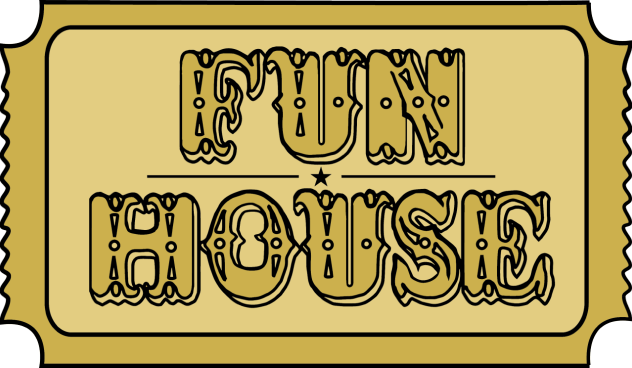
The final Fun House logo emerged from a long, iterative process where I refined both the structure and the personality of the design. I chose this logo and its gold colour scheme because it captured the exact tone I wanted the brand to communicate - playful, magical and high‑end. A major influence behind this decision was the Wonka universe, particularly the golden ticket from Willy Wonka & the Chocolate Factory. The idea of a limited, special invitation into a world of imagination aligned perfectly with the Fun House concept. Gold also carries strong associations with luxury, celebration and excitement, which helped elevate the brand beyond simple funfair nostalgia.
To build the logo, I started by taking ticket shapes I had found during my funfair research and tracing their outlines in Illustrator. This gave me a set of basic structural forms to experiment with. Exploring different ticket silhouettes helped me understand what looked most visually appealing, what felt closest to an authentic funfair ticket, and what would give me flexibility for future brand extensions. Once I settled on a shape, I moved on to integrating the typography.
I scanned my chosen typeface into Illustrator and began adjusting the letter positioning inside the ticket frame. This stage involved testing multiple alignments, spacing variations and decorative elements. Eventually, I settled on a bottom‑heavy alignment, separated by a horizontal line and a central star. The star added a subtle decorative flourish, and when the logo was minimised, it still held its clarity, confirming that the design worked at all scales.
Colour exploration came next. I initially tested combinations of primary colours, thinking that simplicity and boldness would appeal to the target audience. I tried variations of red, then experimented with blue and yellow, and even attempted designs using all three primaries together. While these options were lively, none of them captured the brand’s personality as strongly as the gold version. The gold design immediately felt more distinctive, more magical, and more aligned with the Wonka‑inspired narrative of entering a special, joyful world.
In the end, the gold Fun House logo became the perfect anchor for the brand - a blend of funfair nostalgia, confectionary magic and high‑end visual appeal.


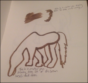
To prepare for creating the Fun House mascots, I carried out a dedicated life‑drawing trip to Newham City Farm in East London, focusing specifically on sketching horses. Before this visit, horses were one of the most challenging animals for me to draw - the proportions between the body and legs, the long neck joint, and the structure of the face all felt difficult to capture accurately. I knew that if one of my mascots was going to be horse‑based, I needed to understand the form properly, not just rely on stylised guesses.
Drawing horses from life changed everything. Working quickly and freely forced me to focus on movement, gesture and overall shape, rather than getting stuck on details. Many of the sketches were messy, but those loose pages were some of the most valuable; they helped me get used to the rhythm of the horse’s form and understand how the body connects in motion. When drawing animals from life, this fast, expressive approach is often the only way to capture them before they shift position.
I also took photographs during the visit, which allowed me to create more refined, structured drawings afterwards. These helped me translate the loose observational sketches into clearer forms that could be developed into mascots. In some cases, the refined drawings looked genuinely strong - confident lines, better proportions and a clearer sense of personality.
Throughout the process, I experimented with a wide range of mediums: pencils, fineliners, copic markers, biro pens and paints. Switching tools helped me understand which styles felt most natural and which could translate best into the final mascot designs. This experimentation also guided my decision to create both hand‑drawn and digital versions of the mascots. The hand‑drawn style offered warmth and character, while the digital versions would integrate more easily into the packaging layouts and allow for cleaner, scalable shapes.


The final Fun House mascots were the result of a long, iterative process that combined life drawing, character experimentation and visual refinement. I produced both hand‑drawn versions, coloured with Copic markers, and digital versions, coloured in Illustrator. Seeing the mascots in both formats helped me understand how their personalities translated across mediums. The hand‑drawn designs were more detailed and expressive, showing every mark, texture and nuance from the sketchbook stage. The Illustrator versions, however, felt cleaner and more adaptable, especially important given that the packaging was going to be designed digitally.
I chose each mascot’s colour palette, hair style and outfit based on the experiments I had carried out earlier in my sketchbook. I tested multiple combinations, drawing inspiration from funfair imagery, confectionary colours and the visual cues I had already established in the logo development. Just like with the logo, I made sure to work with as many relevant reference images as possible - horses from Newham City Farm, funfair characters, retro packaging mascots and expressive illustration styles. This ensured that every design decision was grounded in research rather than guesswork.
Developing the mascots in both traditional and digital formats also helped me decide how they would function across the brand. The hand‑drawn versions carried a warmth and charm that reflected the playful spirit of Fun House, while the digital versions offered clarity, scalability and consistency - essential qualities for packaging, advertising and future brand extensions. In the end, both approaches contributed to the final identity, proving that the mascots could exist comfortably in multiple visual contexts while still feeling cohesive and character‑driven.
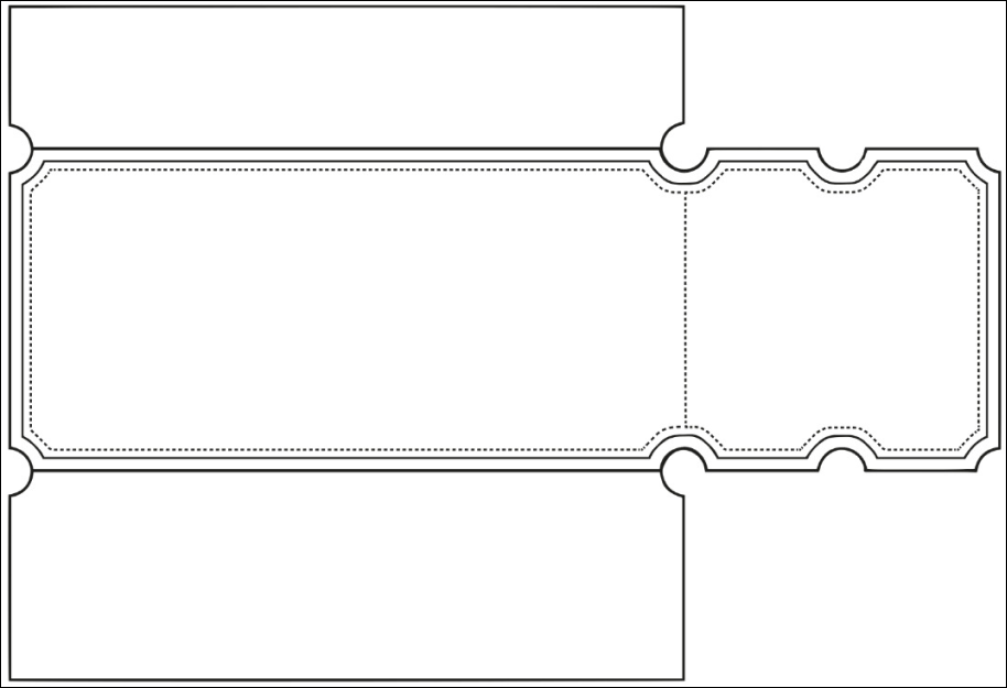

For the packaging stage of the Fun House brand, I designed a series of nets that were directly informed by the ticket‑shaped identity established in the logo. These nets weren’t just structural templates - they were an opportunity to merge practical function with visual storytelling, making the packaging feel cohesive, purposeful and tied to the funfair theme.
I created each net with the idea that the ticket ends could be torn off, just like a real funfair admission ticket. For the chocolate bar, this became a key feature: the ends could be torn away and then resealed, giving the packaging a playful, interactive quality while still serving a practical purpose. This integration of design aesthetics with usability helped reinforce the brand’s personality - every part of the packaging felt like part of the Fun House experience.


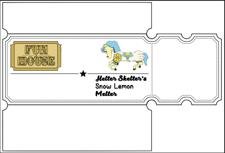
For the Fun House chocolate bar, I began by creating a series of layout tests that built directly on the sketches and structural ideas developed earlier in my sketchbook. This stage was about translating rough visual thinking into clearer digital compositions, allowing me to see how the core brand elements (the logo, the mascot, and the product name) would interact on the final packaging.
I tested multiple arrangements to understand where each piece of information would be most effective. The chocolate bar needed to communicate quickly and clearly, especially in a crowded retail environment, so it was essential that the three key elements worked together without competing for attention. Placing the logo helped establish brand recognition, the mascot added personality and flavour‑specific storytelling, and the product name ensured clarity about what the customer was buying.
These layout experiments helped me determine hierarchy, spacing and balance. By shifting elements around, enlarging the mascot, adjusting the logo placement, or testing different alignments for the product name, I could see which compositions felt most cohesive and visually appealing. This process also confirmed how the ticket‑shaped net influenced the layout, guiding where content naturally sat within the structure.


For the Fun House popcorn packaging, I carried out a series of layout experiments specifically tailored to the pepperoni pizza flavour, which required a different structural approach compared to the chocolate bar. Because the popcorn bag was vertical, the content naturally lent itself to a stacked hierarchy rather than the corner‑based placements used on the horizontal chocolate packaging. This shift in orientation meant rethinking how the logo, mascot and product name interacted within the taller, narrower space.
I explored multiple vertical compositions, testing how the mascot could sit above or below the logo, how the product name could be integrated without overwhelming the design, and how the ticket‑inspired edges influenced the overall flow. Even though the vertical format encouraged stacking, I still experimented with corner‑based alignments in some tests to see whether elements from the chocolate layout could be adapted. This helped me understand how flexible the brand system was and whether certain visual behaviours could remain consistent across products.
I also considered whether the back of the packaging could be designed horizontally. This idea came from wanting to maintain some visual continuity with the chocolate bar, where horizontal layouts worked particularly well. A horizontal back panel would allow for clearer nutritional information, storytelling elements or mascot interactions, while the front remained vertically structured. Testing both orientations helped me refine how the brand could shift between formats without losing coherence.

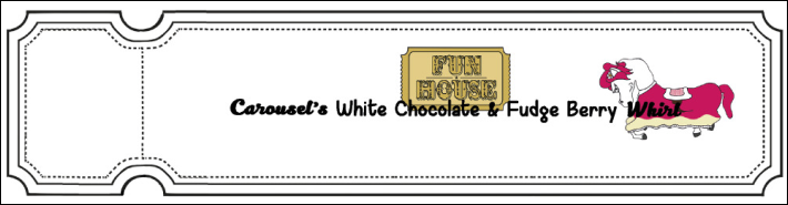

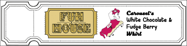
For the Fun House milkshake label, I carried out a series of layout experiments that responded directly to the unique constraints of the format. Unlike the chocolate bar or popcorn bag, the milkshake packaging consisted of a small wrap‑around strip, meaning the available space was far more limited. Because of this, every design decision had to be deliberate - the logo, mascot, flavour name, barcode and nutritional information all needed to coexist without overwhelming the narrow layout.
I approached the development by testing how the core brand elements could be arranged along the strip while still remaining readable once wrapped around the bottle. Since the label didn’t require cutting or assembling, the focus shifted entirely to clarity, hierarchy and spacing. I experimented with different alignments, checking how the mascot interacted with the logo, how much room the flavour name needed to stand out, and where the mandatory information could sit without feeling cramped.
One of the biggest challenges was ensuring that none of the content became too large or too small. With limited horizontal space, enlarging the mascot or logo risked pushing the barcode or nutritional details out of view. On the other hand, shrinking elements too much would make the design feel weak and unreadable on a curved surface. These tests helped me find the balance between expressive branding and practical legibility.

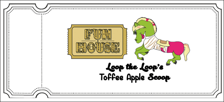

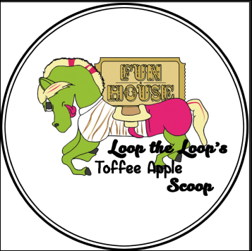
For the Fun House ice cream packaging, I developed a series of layout experiments that explored both the tub label and the lid design, each requiring its own approach to hierarchy, spacing and visual balance. Because the ice cream tub introduced a cylindrical format and a separate circular surface, this stage involved thinking about how the brand elements behaved across multiple planes rather than a single flat layout.
I began by testing how the logo, mascot, flavour name and ticket‑inspired motifs could wrap around the tub. The curved surface meant that content needed to be distributed evenly so that no single area felt overcrowded or visually heavy. I experimented with horizontal bands, centred compositions and staggered placements, checking how each option worked when imagined on a rotating product. The goal was to ensure that the brand identity remained clear from every angle, not just the front.
The lid required a different strategy. Its circular shape offered an opportunity to create a bold, top‑down moment of branding - something that would stand out immediately when viewed from above in a freezer or on a shelf. I explored radial layouts, mascot‑centred designs, and logo‑dominant compositions, testing how the flavour name could sit either beneath or around the central elements. The lid also needed to feel connected to the tub label, so I made sure the colour palette, decorative shapes and typographic choices aligned across both components.


To support the wider Fun House packaging system, I developed a set of custom Photoshop brushes that were directly informed by the flavours, themes and visual cues established throughout the project. These brushes became an important part of the brand’s expressive language, allowing me to integrate hand‑drawn elements into digital layouts while keeping everything cohesive and flavour‑specific.
I designed each brush by creating hand‑drawn illustrations based on foods and ingredients linked to the different products - pepperoni slices for the popcorn, chocolate pieces for the bar, and ice‑cream‑related motifs for the tub. Alongside these flavour‑based drawings, I also produced brushes inspired by funfair content, such as stars, stripes, bursts and decorative shapes. These funfair elements were especially useful because they could be applied across every product, helping unify the packaging and reinforce the carnival‑themed identity.
Once the drawings were complete, I scanned them and converted them into Photoshop brush presets. Seeing the hand‑drawn imagery transformed into digital tools was incredibly satisfying; Photoshop preserved the texture and personality of the original marks while allowing them to be used flexibly across layouts. This meant I could quickly add flavour‑specific decoration, enhance backgrounds, or create dynamic patterns without losing the authenticity of the hand‑drawn aesthetic.
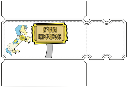


For the Fun House chocolate bar, I documented the full construction process of the final packaging, beginning with the layout experiment I had previously selected as the strongest foundation. I chose to start with the chocolate bar because it felt like the most popular and shelf‑friendly product, meaning its display impact was especially important. As I continued adding more elements, the layout naturally evolved - small adjustments were needed to accommodate new content while keeping the hierarchy clear and visually balanced.
I incorporated my custom brushes throughout the design, using them to enrich the background and add flavour‑specific decoration. One of my favourite parts of this stage was developing the ticket background pattern. I created it by duplicating the logo, erasing the internal content, enlarging the outline slightly, and placing the layer behind the main logo. I then duplicated this ticket outline multiple times, arranging them in a neat horizontal line. After selecting each ticket shape and contracting the selection, I filled them with colours that matched the existing palette - tones drawn from the mascots, type and overall packaging scheme. Each ticket then received a brush overlay, again chosen to fit the colour story and reinforce the funfair identity.
Typography became another major focus. To make the type feel integrated with the rest of the design, I used the warp transform tool to distort and reshape the text, echoing the expressive lettering styles I had seen in my research. This gave the type a sense of movement and personality, helping it flow with the surrounding illustrations. Adding a white stroke and drop shadow made the text stand out clearly from the busy background, ensuring that every key element remained readable and visually distinct.
For the main background, I created a collage of brushes relating to the chocolate flavour, using blue to tie in with the mascot’s hair and yellow to match the core colour scheme. I placed this collage beneath the ticket strip and used a low‑opacity brush to gently erase around the text, blending everything together. I then duplicated the brushed layer, erased around the type again for clarity, and set the layer to Overlay to intensify the colours and textures. This gave the background a richer, more dynamic finish.
To complete the design, I added a blue texture to the top section of the packaging, giving it a final touch of depth and colour harmony. With all these elements combined (the ticket pattern, warped type, brush collage and texture) the chocolate bar packaging became a vibrant, cohesive piece that fully embodied the Fun House brand.


For the Fun House popcorn packaging, I continued the construction process using many of the same techniques that I had refined during the chocolate bar development. Because the popcorn bag shared the same funfair‑ticket visual language, it made sense to carry over the established methods (layered ticket motifs, brush‑based decoration, warped type, and colour‑driven hierarchy) while adapting them to the vertical format and flavour‑specific content.
I began by selecting one of my earlier layout experiments as the structural base. Just like with the chocolate bar, this initial layout provided a clear starting point for placing the logo, mascot, flavour name, and ticket edges. As I added more elements, the composition naturally evolved, requiring small adjustments to spacing and alignment to keep everything readable within the taller, narrower frame of the popcorn bag.
I applied my custom brushes throughout the design, using flavour‑related imagery (pepperoni slices, pizza textures, and funfair decorative shapes) to build energy and reinforce the theme. These brushes helped fill the vertical space without overwhelming it, creating a lively background that supported the main content rather than competing with it.
The ticket motif returned as a key structural and decorative element. I duplicated the logo outline, removed the internal content, enlarged it slightly, and placed it behind the main branding, just as I had done for the chocolate bar. This created a repeating ticket strip that visually tied the popcorn packaging back to the rest of the brand. I filled each ticket with colours drawn from the mascot and flavour palette, then added brush overlays to give them texture and personality.
Typography followed the same development logic as before. I used the warp transform tool to shape the flavour name so it flowed with the surrounding illustrations, echoing the expressive type styles found in my research. A combination of white strokes, drop shadows, and careful placement ensured that the text remained clear even against the busy, brush‑filled background.
The background itself was built using layered brush collages, adapted to suit the pepperoni pizza flavour. I blended these layers using low‑opacity erasing and overlay effects, just as I had done for the chocolate bar, creating depth and vibrancy without losing clarity. The final touches involved adding colour textures to the top and bottom sections of the bag to unify the palette and give the packaging a polished finish.


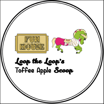



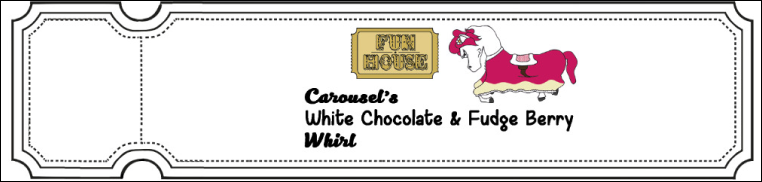


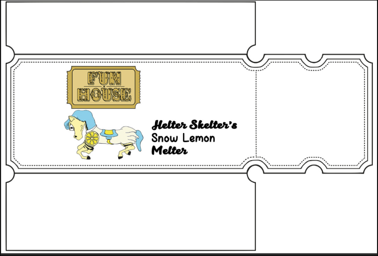


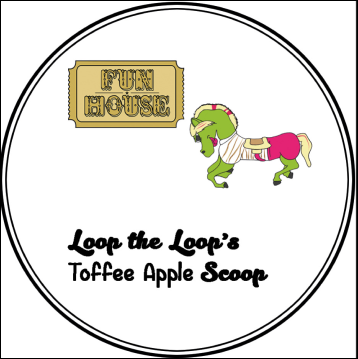


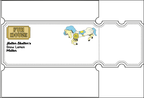


The final Fun House branding brought together every element developed throughout the project (the characters, logo, flavour identities, funfair‑inspired visuals, custom brushes, and fully constructed packaging nets) into a cohesive, joyful and high‑energy confectionary brand. Each product was designed with complete attention to detail, featuring the mascots, the gold ticket‑inspired logo, clear flavour naming, expressive illustration, and all required nutritional information, ensuring the range felt both professional and commercially ready.
OUTCOME


Chocolate Bar

Popcorn Bag

Milkshake Label
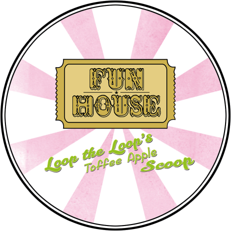
What made this outcome especially meaningful was how each challenge I faced earlier in the project became a solved problem by the end:
• Horse anatomy - initially one of my biggest obstacles which became a strength after life‑drawing at Newham City Farm. This directly improved the mascot designs, giving them believable structure and personality.
• Logo clarity was achieved through extensive thumbnail sketching, type experimentation and refining the ticket shape until it worked at every scale.
• Typeface limitations were overcome by morphing serif fonts into funfair‑style lettering, proving I could transform simple type into expressive, brand‑specific forms.
• Packaging hierarchy became manageable through repeated layout tests across chocolate, popcorn, milkshake and ice‑cream formats, each with its own spatial constraints.
• Visual cohesion was strengthened by creating custom Photoshop brushes, allowing hand‑drawn imagery to integrate seamlessly into digital packaging.
• Colour consistency was maintained by building palettes around the mascots, logo and funfair motifs, ensuring every product felt part of the same world.
• Brand storytelling was reinforced through the golden‑ticket concept, tying the entire identity to a sense of magic, exclusivity and funfair nostalgia.
By the time the full range was complete, every product (chocolate bar, popcorn bag, milkshake label and ice‑cream tub) felt like a fully realised piece of the Fun House universe. The mascots brought personality, the ticket shapes added structure and charm, and the brushes created lively, flavour‑specific backgrounds that made each item instantly recognisable.
Most importantly, this project achieved exactly what I set out to do: to design the dream confectionary products I would want for myself. It allowed me to combine illustration, branding, packaging design and storytelling into one unified system, and in doing so, it solidified my love for packaging design as a discipline. Seeing the final products together, vibrant, character‑driven and professionally constructed, made me genuinely proud of the world I built.
Ice Cream Label
Ice Cream Lid
