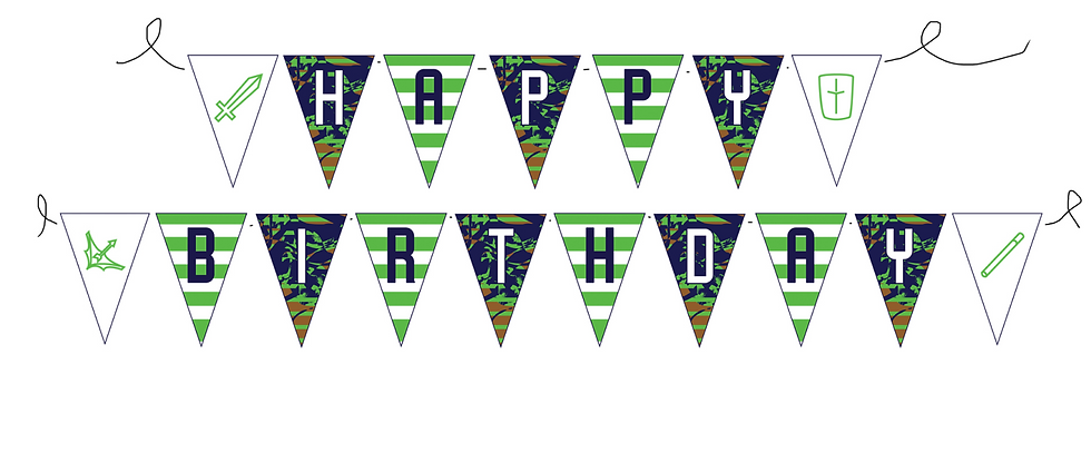
Bunting
Every element was designed with function in mind. The invitations included all necessary RSVP information in a clear, readable layout, while the patterns and vector illustrations across the range reinforced the gaming theme without overwhelming the designs. The final suite worked as a complete, unified collection - visually engaging, age‑appropriate and built with the end user firmly in mind.

HAPPY PALACE PARTY MATERIALS
INTRODUCTION TO BRIEF
The brief for this project was to develop a full set of party materials for children’s celebrations, all built around an energetic, video‑game‑inspired theme. The product range included gift bags, plates, napkins, cups, bunting, a tablecloth and invitations, each needing to feel fun, engaging and instantly relatable to kids. The central phrase “Ready Up” acted as the unifying hook, capturing the excitement and anticipation familiar to young gamers. The challenge was to create visuals and colour choices that felt bold, playful and immersive, ensuring children could immediately connect with the theme and appreciate the vibrancy of the designs. The brief encouraged a lively, characterful approach that celebrated gaming culture while remaining accessible for a wide age range.
BRIEFING THE PROBLEM
This brief came with a surprisingly delicate set of challenges, despite the playful nature of kids’ party design. The first hurdle was tone: the visuals needed to feel fun and gaming‑inspired without slipping into anything too immature. These products were aimed at children, not toddlers, so the designs had to strike a balance between colourful excitement and a level of coolness older kids would actually appreciate. At the same time, modern gaming culture often includes fighting or combat themes, but incorporating anything violent would be inappropriate for the age group, meaning the visual language had to stay energetic and recognisably “gamey” while remaining completely safe and age‑appropriate.
Another challenge was avoiding anything that might make kids cringe. Children are quick to disengage from designs that feel patronising or outdated, so the visuals had to feel current, relatable and aligned with the aesthetics they already enjoy in contemporary games. Achieving this required careful consideration of colour choices, iconography and stylistic references.
Finally, the project came with a tight four‑day deadline, adding pressure to produce a full suite of products (gift bags, plates, napkins, bunting, cups, invitations and a tablecloth) within a very limited timeframe. This meant making confident design decisions early, maintaining momentum and ensuring every element worked cohesively without the luxury of extended refinement.
PROCESS AND TOOLS
I created the full suite of Happy Palace party materials in Adobe Illustrator, building each product from a consistent visual foundation. The design system centred around two key colours: a bright, tech‑inspired green that captured the energy of gaming culture, and a rich purple that complemented it while reinforcing the cyber‑theme. These colours became the backbone of every item (gift bags, plates, napkins, bunting, cups, invitations and the tablecloth) ensuring the entire range felt unified and instantly recognisable.
To make the designs genuinely relatable to kids, I incorporated gaming terminology they would recognise and enjoy, weaving familiar phrases and UI‑style elements into the layouts. I also created a set of custom vector illustrations inspired by video‑game iconography, giving each product its own personality while still fitting within the overall theme. Patterns, shapes and layered motifs were arranged to bring each item to life, striking the balance between playful and age‑appropriate.
This project was completed entirely independently, without liaising with anyone else, which meant every creative decision, from colour selection to layout composition, was driven by my own judgement and understanding of what would resonate with the target audience. The result was a cohesive, energetic set of party materials that felt modern, fun and perfectly aligned with the gaming‑inspired brief.


Gift Bag

Plate
Cup

Tablecloth
Invitation
Napkin
The final outcome was a cohesive, energetic range of party products that met the brief exactly as intended. Each item, from plates and napkins to bunting, cups, invitations and the tablecloth, felt fun, modern and genuinely appealing to kids, without tipping into anything too childish or off‑tone. The combination of bold visuals, a playful gaming‑inspired typeface and the bright green‑and‑purple colour palette created a strong identity that looked both exciting and commercially viable. I could clearly imagine these products being sold in shops; they have the polished, purposeful feel of real retail partyware.
OUTCOME
