
RAY BAN - LIFE THROUGH MY EYES BOOK AND BRANDING
INTRODUCTION TO BRIEF
This university brief centred on creating a deeply personal branded “shrine” book, guided by the prompt Objectify, Deify, Glorify - a challenge to take an everyday personal item and elevate it into something symbolic, treasured and worthy of storytelling. The project encouraged expressive visual identity work, introspection and narrative‑driven design, asking students to treat their chosen object as a lens through which their values, memories and identity could be explored.
I chose my Ray‑Ban glasses as the focal object, as they hold significant meaning for me. They transformed my confidence, shaped how I see the world both literally and metaphorically, and became an accessory tied closely to my sense of self. Their role in my life made them a perfect subject for a project built on emotional resonance and personal symbolism. As an accessory, they also offered rich potential for visual storytelling, from reflections and lenses to identity, perspective and transformation, giving me a wide creative space to develop branding, narrative structure and illustrative content.
The brief’s combination of personal meaning, conceptual branding and book design allowed me to merge introspection with creativity, resulting in a project that felt both emotionally grounded and visually expressive.
BRIEFING THE PROBLEM
One of the core challenges in developing the Life Through My Eyes project was finding a way to make the work feel genuinely reflective of me without crossing into anything overly sentimental or cringeworthy. The brief asked for deep personal meaning, but the outcome still needed to feel polished, intentional and rooted in strong branding rather than pure autobiography. Striking that balance, honest but not indulgent, expressive but still designed, became a central problem to solve.
Another challenge was communicating the layers of significance behind the glasses. They aren’t just a functional object; they represent confidence, identity and a literal and metaphorical shift in how I see the world. The project needed to show that importance clearly, elevating the glasses beyond their everyday role and framing them as a symbol of perspective, growth and self‑assurance. This meant building visual storytelling that went deeper than “a pair of glasses I like,” instead presenting them as a transformative object with emotional weight.
Finally, the brief required making the glasses feel like a gateway to a different way of viewing the world. The challenge was to translate that idea into design, through imagery, narrative, layout and tone, so the book didn’t just tell the viewer why the glasses matter, but showed it through thoughtful, layered visual choices.
RESEARCH
My research for the Life Through My Eyes project began with exploring contemporary shrine concepts, many of which were sourced by my tutor. These examples demonstrated how artists transform personal objects into symbolic artefacts, each with its own emotional depth and narrative intention. Some shrines carried meanings that were immediately clear, while others relied on more abstract or layered storytelling - a useful reminder that personal significance can be communicated in many different visual forms.


I was particularly drawn to shrine projects that used photomontage, as this technique creates a scrapbook‑like aesthetic that feels intimate, expressive and full of personality. The idea of combining photography, textures and layered imagery aligned perfectly with the emotional tone I wanted for my book, helping me envision how my glasses could be framed as a gateway to memory, confidence and perspective.
Another influential example was a shrine built around a pair of customised shoes. This project showed how an everyday item can be elevated through personalisation, symbolism and narrative context. It reinforced the idea that my glasses could be treated not just as a functional accessory, but as a meaningful object shaped by experience - something that represents identity, transformation and the way I see the world.
This research helped establish the conceptual foundation for the project, guiding how I approached visual storytelling, symbolism and the emotional tone of the final book.


PROCESS AND TOOLS
The process behind Life Through My Eyes combined traditional craft, digital refinement and guided experimentation to build a personal yet polished visual narrative. I began with hand‑drawn sketches, using them to explore early concepts and emotional directions. Working traditionally at the start helped keep the ideas honest and personal, grounding the project in the object’s real significance before moving into more structured digital development.
From there, I transitioned into Photoshop and Illustrator, using my own photography and personal imagery wherever appropriate. Photoshop allowed me to experiment with layered compositions, textures and photomontage techniques — echoing the scrapbook‑like aesthetic I admired during research. Illustrator was used to refine graphic elements, create clean vector shapes and develop any branding components that needed precision and consistency.
Throughout the project, I liaised closely with my tutor, whose feedback helped push the work beyond the obvious and into something more conceptually rich. I was encouraged to use experimental image‑making techniques, exploring distortion, layering, abstraction and unconventional compositions to discover visuals that felt impactful and symbolic. This exploratory approach ensured the final book wasn’t just a documentation of an object, but a thoughtful piece of visual storytelling that communicated confidence, perspective and personal transformation.
DEVELOPMENT
The development of the Life Through My Eyes project was shaped by a mix of conceptual exploration, personal reflection and hands‑on experimentation.


After researching contemporary shrine designs, I began mapping out what my own shrine could be. I brainstormed a range of personal objects, but my glasses quickly emerged as the strongest choice. To ground the concept, I wrote a full sketchbook page detailing why they matter to me - their impact on my confidence, their cultural relevance, and the symbolic role they play in how I see the world. This became the foundation for generating ideas for the images and the shrine itself, each one linked to a different facet of the glasses: eyesight, value, identity, transformation and more.


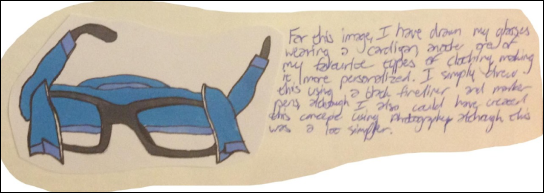


I then moved into visual experimentation, exploring multiple ways of depicting the glasses. This included drawings, cut‑outs, photo manipulation, and techniques inspired by both modern and contemporary illustration. The goal was to discover imagery that felt expressive, symbolic and layered, not just literal representations of the object. These experiments helped build a diverse visual library that fed directly into the final shrine.


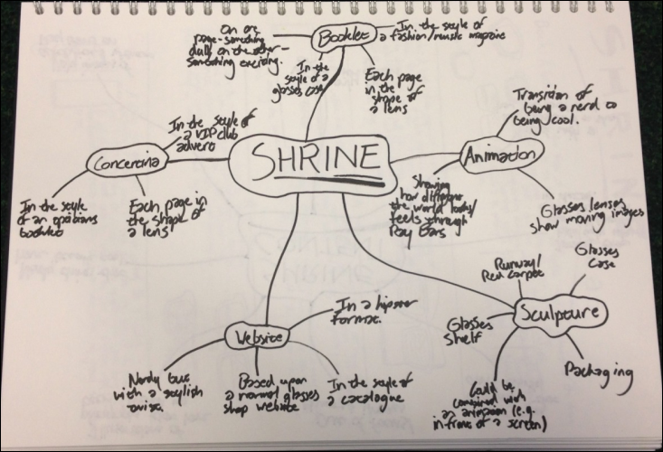
Once the conceptual groundwork was set, I began developing the shrine’s format. After mapping out several possibilities, I decided the shrine should take the form of a book, allowing for narrative flow, emotional pacing and a clear before/after structure. I planned the story around the idea of showing valuable parts of my life in two states: one side blurry, representing life before the glasses, and the other in sharp clarity, representing life after. Each spread paired imagery with personal reflections, creating a cohesive piece of visual storytelling.
To elevate the project further, I designed a glasses case as a piece of packaging that would house the book. I studied different case aesthetics to determine which structure would best accommodate a label and additional design elements. After establishing the form, I explored colour choices and visual accents that aligned with the emotional tone of the book.
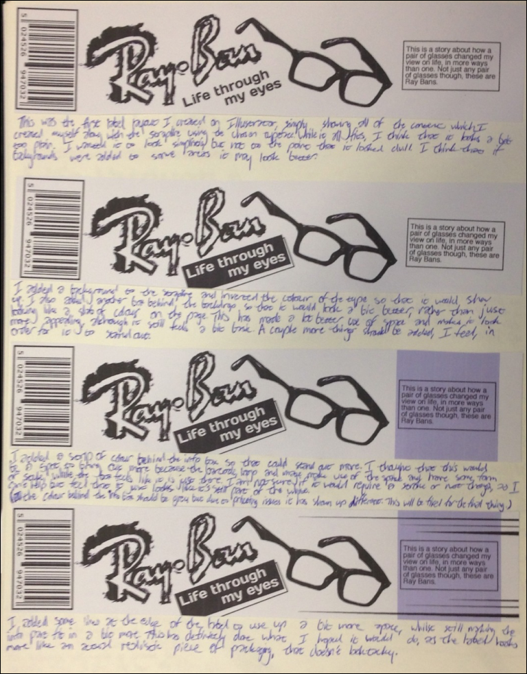

The next stage was developing the label for the case. I broke down the structure of a typical packaging label into content blocks, deciding what information belonged where and why. From there, I created imagery by retouching selected pieces from the images and experimenting with paint, texture and typography. Producing multiple variations proved invaluable - each experiment revealed something new, and the final label emerged from this playful, expressive process rather than a rigid, overly tidy approach.


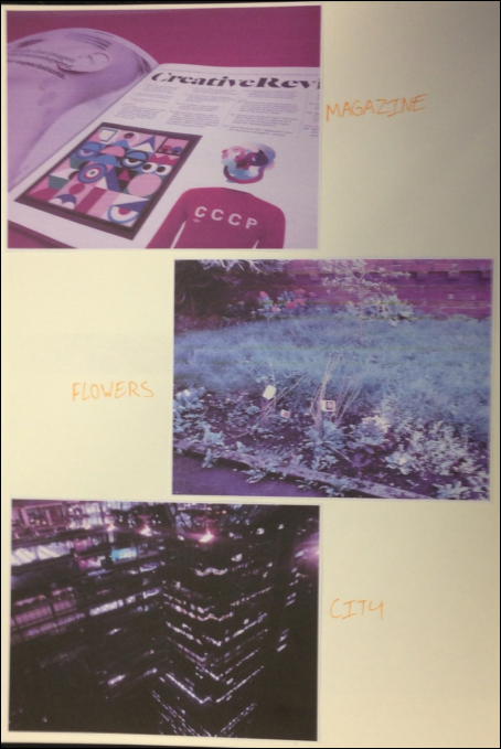


The final sketchbook pages focused on sequencing the book’s content, pairing photographs with their accompanying stories and arranging them in a narrative order that moved from uncertainty to clarity. On the last page, I documented the full list of processes used and reflected on their success, completing a development journey that was both introspective and creatively expansive.
The final outcome of the Life Through My Eyes project was a fully conceptualised, narrative‑driven book that explored how my Ray‑Ban glasses have shaped the way I see the world, both literally and emotionally. The book presented a curated sequence of imagery and personal reflections, moving between blurry, uncertain visuals and sharp, high‑definition moments to illustrate the transformation the glasses brought to my confidence, identity and everyday experiences. This was all housed within a cool, glasses‑case‑style piece of packaging, designed as a branded outer shell that elevated the project from a simple book into a complete shrine artefact.
OUTCOME


Packaging and Label
Packaging, Label and Book: Part 1
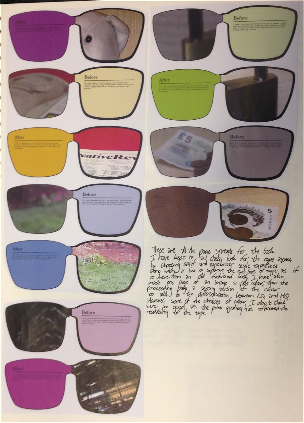
Book: Part 2
Although the project remained conceptual and didn’t require physical production, the outcome was well received for its emotional clarity, strong visual storytelling and thoughtful approach to personal branding. It became a powerful way to develop my visual communication skills, allowing me to merge experimental image‑making, narrative structure and packaging design into one cohesive piece. Most importantly, it gave me the chance to celebrate different areas of my life that matter to me, presenting them through a lens, literally, that has shaped who I am.
