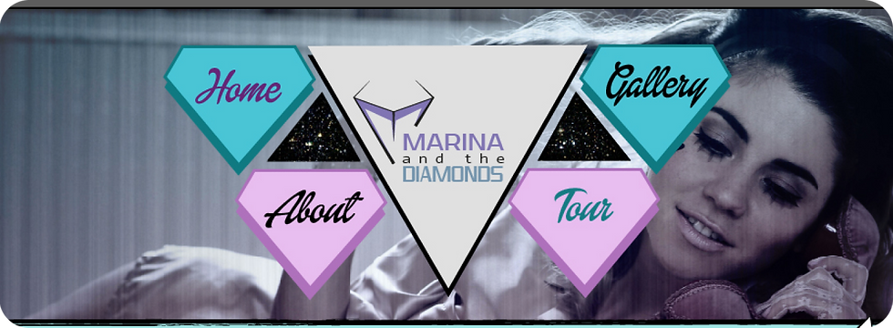
MARINA AND THE DIAMONDS DIGITAL BRANDING
INTRODUCTION TO BRIEF
This university brief required creating a full suite of branding materials for a chosen favourite artist or band, including a functioning website, a bespoke logo and a promotional tour poster. I selected Marina and the Diamonds, drawing on my genuine connection to her music and visual world to inform the creative direction. The website needed to be fully built using HTML and CSS, with a clear structure consisting of a homepage, gallery, about page and tour page. The homepage also had to feature an interactive competition element to encourage engagement and make the site feel lively and fan‑focused.
The brief wasn’t just about aesthetics - it required a technically sound, properly coded site that functioned smoothly and reflected Marina’s theatrical, emotional and stylistically bold identity. Balancing the technical build with expressive visual design became central to the project, ensuring the final outcome felt both immersive and professionally structured.
BRIEFING THE PROBLEM
This brief presented a set of creative and technical challenges that shaped how the Marina and the Diamonds branding needed to be approached. As a long‑time fan, one of the biggest obstacles was doing Marina justice - creating visuals that genuinely reflected her theatrical, emotional and stylistically bold identity without feeling like imitation. The designs needed to market her effectively, capturing the essence of her artistry while still standing confidently as original work.
A second challenge came from the technical side. The website had to be fully built using HTML and CSS, and while I had dabbled in coding before, this project required a level of usability, structure and polish beyond casual experimentation. Ensuring the site functioned smoothly across multiple pages (homepage, gallery, about and tour) meant balancing design ambition with practical, accessible web development.
Another problem to solve was finding the right visual tone. The site needed to feel aligned with the aesthetic of other contemporary pop stars’ websites, but without copying their style or falling into generic pop‑branding tropes. It had to feel recognisably “Marina” - dramatic, glamorous, slightly surreal, while still standing out as a unique interpretation.
Altogether, the brief demanded a blend of fan‑level passion, thoughtful branding strategy and solid technical execution, making it a project that pushed both creative and practical skills.
RESEARCH
My research for the Marina and the Diamonds branding project focused on understanding both Marina’s existing visual identity and the wider landscape of contemporary pop‑star branding.

I began by studying Marina’s previous eras, from where she started to The Family Jewels to Electra Heart, paying close attention to her evolving logos, colour palettes and stylistic motifs. This gave me a foundational sense of her aesthetic trajectory and helped me position my own branding concept as a natural “next stage” rather than a repeat of something she had already done.
I also researched other pop artists’ branding to understand what was trending in the industry and what makes a visual identity feel current, distinctive and commercially strong. Looking at how major pop stars structure their logos, websites and promotional materials helped me identify common patterns while also highlighting opportunities to differentiate Marina’s branding without drifting too far from genre expectations.

To inform the website design, I explored successful, clean website layouts and UI patterns, focusing on clarity, hierarchy and user flow. Analysing grid‑based structures was especially helpful; I completed a webpage construction exercise using a grid system, which strengthened my understanding of how to organise content effectively across multiple pages. This research ensured the final site felt both visually expressive and technically sound, with a layout that supported the theatrical tone of Marina’s world while remaining easy to navigate.

To inform the website design, I explored successful, clean website layouts and UI patterns, focusing on clarity, hierarchy and user flow. Analysing grid‑based structures was especially helpful; I completed a webpage construction exercise using a grid system, which strengthened my understanding of how to organise content effectively across multiple pages. This research ensured the final site felt both visually expressive and technically sound, with a layout that supported the theatrical tone of Marina’s world while remaining easy to navigate.
PROCESS AND TOOLS
For this project, I built the Marina and the Diamonds website using a combination of digital design and front‑end development tools, blending visual creativity with practical coding. I began by designing each page layout in Photoshop, using the slice tool to export individual interface elements (buttons, banners, backgrounds and navigation components) in a way that would translate cleanly into a functioning website. These assets were then brought into Dreamweaver, where I constructed the site using HTML and CSS, ensuring that the homepage, gallery, about page and tour page all worked smoothly and reflected Marina’s theatrical, emotionally charged aesthetic.
Alongside the website, I created a bespoke logo in Illustrator, exploring shapes, lettering and visual motifs that aligned with her bold pop persona. The tour poster was developed in InDesign, allowing for precise control over typography, composition and image placement. Throughout the project, I liaised closely with my tutor, whose feedback helped refine both the visual direction and the technical execution. This collaboration ensured the final outcome felt cohesive, expressive and professionally structured across all deliverables.
DEVELOPMENT
The development phase of the Marina and the Diamonds branding project was where the research began to translate into concrete visual decisions.

After analysing how similar pop artists and bands were marketed, I started by gathering everything I knew about Marina - her personality, her artistic evolution, her visual motifs and her full discography up to that point. Having this information clearly laid out helped anchor the direction of the branding and ensured that every design choice felt connected to her identity rather than generic pop aesthetics.


I explored a range of type choices for the logo, assessing which styles best reflected Marina’s theatrical, glamorous and slightly eccentric persona. From there, I began drafting logo concepts, focusing on a diamond‑based idea that could symbolise her name while offering room for stylistic interpretation.


I sketched multiple variations of the diamond motif, experimenting with different shapes, angles and levels of abstraction to find a version that felt fresh and representative of a new era. Once I identified the strongest concept, I developed it further in Illustrator, refining the structure, experimenting with colour treatments and integrating the chosen typefaces. This stage was about balancing expressiveness with clarity - ensuring the logo felt bold and iconic while still functioning across digital and print applications.


For the website, I designed each page’s visual style and layout, working from a grid structure to organise content cleanly and consistently. This approach helped maintain usability across the homepage, gallery, about and tour pages while still allowing room for Marina’s dramatic aesthetic to shine through. Each page was built piece by piece, incorporating the necessary information and ensuring the visual tone matched the branding established through the logo and poster development.


OUTCOME
The final outcome of the Marina and the Diamonds branding project was a complete visual and digital package: a bespoke logo, a fully designed multi‑page website and a promotional tour poster. Together, these deliverables formed a cohesive identity built around a colourful, celestial, emotionally charged aesthetic that reflects Marina’s theatrical pop persona. Every page of the website, from the homepage to the gallery, about and tour sections, carried the same consistent visual language, creating a unified experience that felt immersive, expressive and true to her artistic world.

Homepage

About Page (Scrolled Up)

Tour Poster
This project also served as a major step forward in developing my HTML and CSS skills, pushing me to translate static designs into functional, structured web pages. Working across Photoshop, Dreamweaver, Illustrator and InDesign strengthened my layout abilities and deepened my understanding of how branding extends across multiple formats. The final suite of work feels polished, fan‑driven and full of personality - the kind of project I’d genuinely be thrilled for Marina to see and enjoy.

About Page (Scrolled Down)

Gallery Page

Tour Page
