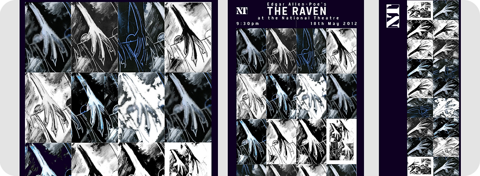
THE RAVEN THEATRE CONTENT
INTRODUCTION TO BRIEF
For this college project, the brief was to develop a full suite of branding materials for a fictional National Theatre production of The Raven by Edgar Allan Poe. The task centred on creating a cohesive visual identity that captured the poem’s dark, atmospheric tone while allowing room for expressive, illustrative design. I was required to produce a poster, ticket, banner and A5 programme cover, each using moody, dramatic visuals that reflected the gothic nature of the story. Although the brief encouraged creativity, every piece needed to feel unified, tonally consistent and appropriate for a National Theatre production. Key production details, including the date and time, had to be clearly integrated into the designs, ensuring the final outputs were not only visually compelling but also functional promotional assets.
BRIEFING THE PROBLEM
This project came with a set of creative challenges that shaped the direction of the final The Raven branding. The first was finding a way to make the visuals feel genuinely serious and atmospheric without slipping into something flat or uninspiring. Poe’s work demands a certain darkness, but the designs still needed to feel engaging at first glance - striking enough to pull the viewer in before they even read the details. Communicating that tone relied almost entirely on moody imagery, which meant every visual choice had to be deliberate and evocative.
Another challenge was stepping outside my usual comfort zone. The brief naturally pushed the colour palette toward deep, restricted tones and a more minimal, restrained approach - very different from my typical illustration‑forward, vibrant style. This meant adapting my process to work with subtler contrasts, heavier shadows and more controlled compositions, all while ensuring the designs still felt expressive and true to the story. Balancing minimalism with impact became a key part of the problem‑solving process.
Overall, the challenge was to create a visual identity that was dark but dynamic, minimal but memorable, and true to Poe’s tone while still showcasing my illustrative strengths.
PROCESS AND TOOLS
For this project, I developed the visual identity for The Raven by building the artwork from the ground up using a mix of traditional and experimental image‑making techniques. I began by creating a series of chalk illustrations of a raven’s claw - a deliberate choice to capture the raw, textured, gothic quality that suits Poe’s world. These analogue drawings became the foundation for a wider set of visual experiments. I inverted and reprinted the artwork, then scanned the images while physically moving them to create distorted, ghostly textures. This process produced a bank of unpredictable, atmospheric visuals that felt naturally eerie and aligned with the tone of the story.
Once the experimental assets were created, I refined them in Photoshop, using gradient maps, layer styles and controlled colour treatments to explore how different lighting and palettes could enhance the mood. These variations were then assembled into a collage‑based motif, forming the core visual element across the poster, ticket, banner and programme cover. The final stage involved integrating the National Theatre branding, ensuring the logo, typography and required production details were placed consistently across all pieces. The result was a set of designs that merged traditional illustration with experimental distortion, creating a dark, cohesive identity that fit the brief while pushing my creative process into new territory.
OUTCOME
The final set of deliverables (the poster, programme cover, ticket designs (front and back) and hanging theatre banner) successfully captured the moody, gothic tone of The Raven while showcasing the experimental visual process behind the artwork. Each piece was built from the chalk‑based raven claw motif and the distorted, inverted image variants, creating a cohesive identity that felt atmospheric, unsettling and true to Poe’s world. Throughout the project, I liaised closely with my tutor, whose enthusiasm for my illustrative, textural approach helped steer the direction and gave me confidence to push the visuals further.
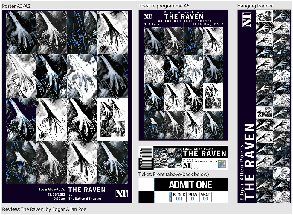
The final designs felt like a genuine evolution of my style - more minimal, darker and more restrained than my usual work, yet still expressive and crafted. Seeing the collage‑driven motif applied across multiple formats demonstrated how adaptable the concept was, and how well it functioned as a full branding suite. I was genuinely proud of the outcome; the pieces not only met the brief but felt strong enough to be displayed for a real National Theatre production, communicating the story’s tone with clarity, drama and a distinctive visual voice.
