
INTRODUCTION TO BRIEF
The objective of this project was to create a website for a travel brand, focussing on skiing holidays with clear direction of inspiration points and mandatory content included in the brief. With the direction given, competitive research was conducted to gather the necessary points of information that competing websites include, their strengths, their weaknesses, opportunities to increase success and threats that need to be addressed, in order to start creating my own website of 5 pages (Home, Destination, Lodging, Payment and Confirmation) on both mobile and desktop, using the research and the user flow to make sure that the designs are considered while meeting the brief to the last detail.
PROCESS OVERVIEW
Being given strict instructions on the brief of the client’s vision, it was crucial to make sure that the vision was delivered with all of the points included in the project, using competitive research into leading travel brands, using the structure of their websites to not only be inspired to use layout and content structure to build my own pages, but to gain understanding of how the user’s journey through these pages takes place on their user flows and apply the same journey on my own pages. Constructing user personas to also add perspectives to potential users of the website also ensured that audiences with different wants and needs would be considered, and that Arctic Travels would have cross-appeal to those who may struggle with some of the websites examined in my research.
With the basic framework applied and an idea of how the research gained could apply to my own designs, I used the brief’s instructions and my own ideas to create a moodboard for potential elements of the pages. Following this, it was time to create the wireframes of the pages, staying true to the brief and making sure that the landing page included all of the elements that the client had asked for and using their suggested areas of inspiration (I.e. Expedia and Booking.com), aiding me in the process of creating all five wireframes for both mobile and desktop.
Next in the process was the design system, taking the elements on the moodboard forward to create and define the colour scheme and typeface styles, and using the wireframes to create and defines the buttons, icons, cards, inputs and grid structures that have been used.
With the design system finished, I applied all of the elements to the final screen designs, making a few adjustments along the way to ensure that the final designs are at their best quality and meeting the client’s vision.
COMPETITIVE RESEARCH
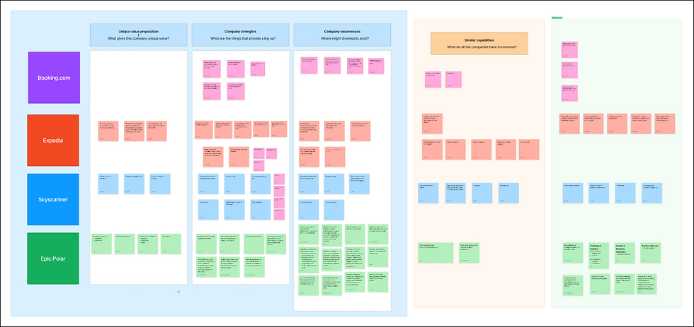
Myself and my peers conducted the competitive research together as collective, conducting a SWOT analysis on Booking.com and Expedia as mentioned inspiration points from the client, but also Skyscanner as another popular online travel directory, and Epic Polar as a direct competitor, specialising in Arctic themed holidays like the client’s brand. This gave me a great idea of inspiration points for our designs, taking into account the usability of these sites and how the user flow is crystal clear in the direction of their pages in the form of call-to-actions, inputs, and well used visual hierarchy.
USER PERSONAS
What inspired you to take an Arctic trip?
"I've always been fascinated by the beauty and isolation of the Arctic wilderness."
"I wanted to challenge myself and experience something completely new and different."
"I've been interested in climate change and wanted to see the effects firsthand."
"The Arctic is visually stunning and would make incredible photo and video content for my audience."
"I’m always looking for unique destinations that stand out on social media."
What are some activities you would be interested in doing during your Arctic trip?
"I would love to see the northern lights and take photos of them."
"I'm interested in learning about the local culture and traditions."
"I'm excited to go dog sledding and snowshoeing."
"I would like to see polar bears in their natural habitat."
"I’d like guided access to the best photography and filming locations."
"I’d enjoy behind-the-scenes experiences that I can document and share with my followers."
What are some concerns you have about travelling to the Arctic?
"I'm worried about the extreme cold and whether I'll be able to handle it."
"I'm concerned about the safety of the trip and whether the guides are experienced enough."
"I'm worried about the impact of tourism on the local environment and wildlife."
"I’m concerned about having reliable Wi-Fi to upload content."
"I’m worried I won’t have enough time or access to capture high-quality content."
What type of accommodations do you prefer when you travel?
"I'm okay with basic accommodations as long as they're clean and comfortable."
"I prefer more luxurious accommodations with amenities like a spa or hot tub."
"I would like to stay in a traditional igloo or other unique Arctic accommodation."
"I prefer visually unique accommodations that photograph well."
"I need good lighting, scenic views, and space to film or edit content."
What is your usual budget for a trip?
"I'm on a tight budget and would prefer a more affordable trip."
"I'm willing to spend more for a high-end experience."
"I usually plan for a mid-range budget that balances comfort and cost."
"I’m willing to invest more if the experience offers exclusive or rare content opportunities."
"If the trip helps grow my audience or brand, I see it as a business investment."
How do you typically plan and book travel experiences?
"I rely on travel agents or tour operators to plan and book my trips."
"I do extensive online research and book my trips through online travel websites."
"I rely on recommendations from friends and family to plan and book my trips."
"I discover destinations through social media trends and other creators."
"I often collaborate with brands or tourism boards when planning trips."
Sample Interview Questions
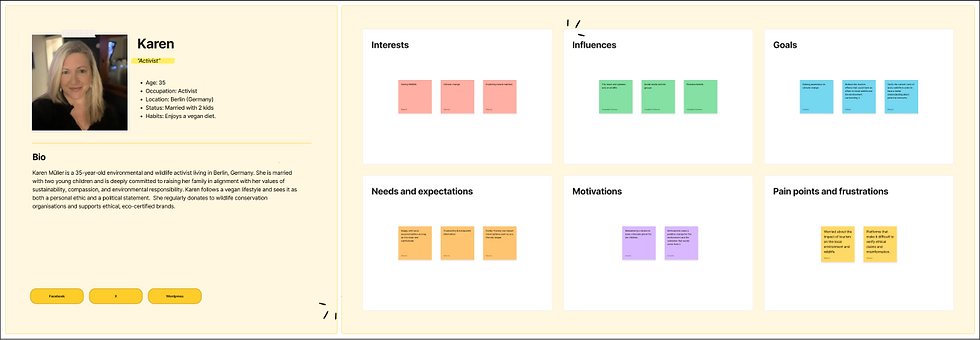
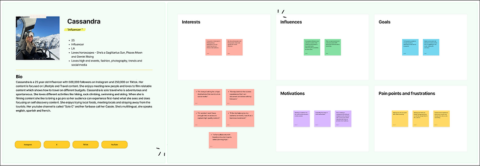
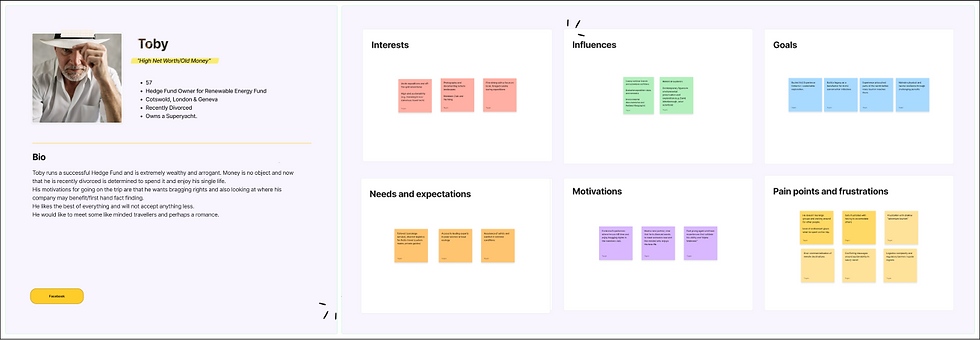
Using the above questions, myself and my peers worked together to create user personas for potential users of the websites, using the sample interview questions to gain an insight into the sorts of people who are interested in using the brand, but have specific wants and needs that would need to be met in the designs. We concluded that the interview questions were potentially posed by an activist, a young backpacker, an influencer, and an older person with money to spend, but only where worthy. Cross-examining each persona, their interests, influences, goals, needs and expectations, motivations and frustration points, we gained an insight into the clientele, and being different age groups with different backgrounds, there were some common points and some very different, but all were to be addressed and applied into our designs.

USER FLOW

I knew that it was important to make the user flow as simple as possible for users with different needs and struggles when it comes to the leading travel websites that they would get the smoothest experience possible, from loading up the webpage, to checking out and receiving their booking confirmation. I made sure to include all the steps in between, and where the next step would require input from the user, and where certain decisions would guide the user to a resolution page (e.g. password recovery if they forgot their password), before taken to the next step. The information architecture had been taken into account, using my competitive research to form a realistic and simple plan for this user flow, acting as a guideline for how the flow of certain pages can prompt the same decision and direct the user further to the intended destination.
From the homepage, there are a variety of ways the user could go before booking on a lodging page, depending on how much information the user would want. If they would want a more thorough explore, then they can check out the regions and resorts before spotting the individual lodging listings - this I consider to be the natural journey for the user, and it has been documented here.
MOODBOARD
For the moodboard, I wanted to make sure that my initial thoughts would be visualised with potential to be used and referred to in my design system further down the line, all having a form of relevancy to the vision in my mind and the clients. Not only have I included the must-haves in the form of imagery, colours, typography, target audience and sample text, but I also picked the mandatory elements of the brief that the client had requested, so that their vision would never get lost.

IMAGERY
My first impressions with potential imagery were obvious - skiing, snow, mountains, arctic wildlife, wood cabins, and associated travel elements. These not only meet the client’s requests for the brief, but have so much aesthetic potential and will naturally peak the user’s interest. One note I will make as I did want to include an arctic fox to represent the wildlife side rather than a polar bear, as the latter can be questionable due to the danger element.
CLIENT’S REQUESTS
The client’s specific requests, which mostly refer to the structure of the landing page, which are simple. The one prompt which triggers creative ability, is the request of a cool colour scheme, which in my brain is crystal clear. Aside from that, the most important thing is making sure that the content that the client asks for is structured clearly, flows nicely, and utilises visual hierarchy to the best standard.
TARGET AUDIENCE
The client made the intended target audience clear in the brief - young professionals, although I wanted to expand on this, taking into account the user personas in the research who are of different age groups and occupations. This ensures that while there is a focus, the designs will have a generalised approach which keeps those outside of the specified target audience happy and wanting to engage.
In my mind, sans serif fonts are the go-to as they have cross-appeal and are informative in the most simple way, but when visual hierarchy elements are applied and colours, weights and styles are utilised properly, can really stand out and add even more value. With an active, sporty tone that spoke so clearly as a fitting option, Address Sans Pro stuck out as a solid choice for headings, although in its regular form, isn’t the best for displaying information. That’s where Comma Sans comes in for the body text and smaller subheadings, being a simple, yet not overused typeface.
TYPEFACES
SAMPLE TEXT
I wanted to use a few ideas of potential snappy headings for sample text that could be used on the copy that are informative and kept short, so that the copy and the imagery can do the talking. These were just a few ideas that I would have been happy to take forward to the wireframes.
COLOURS
Cool colours were the requirement, and nothing says Arctic like blue, which is why I wanted to use a saturated dark blue hue to be the staple colour of this brand, with white complimenting and a midtone blue tint to provide a layer of depth, but I knew I wanted to expand on these more in the design system stage, so I included them here with the hex codes. As alternatives, black is still a must have for sections where information and serious tones are the priority, and a grey tint also compliments the blue scale where used appropriately. Finally, for alternative options, I also used tints of cyan, pink and mint green to represent the Northern lights colour scheme as potential options for tertiary accent colours, but to be used in moderation. These have been included with the intention of showing different layers to the colour palette while still sticking with the cool tones that instruction and used in moderation - blue and white I knew were the most important choices to go with.
WIREFRAMES
Using the user flow and planned visual architecture, I began to create structure for the wireframes, using Expedia and Booking.com as points of inspiration and the common elements they share as the client specified in the brief, making sure to optimise these elements to fit the creative vision in my mind. Each page contains a navigation bar which sits at the top of the page - on the mobile interface, the nav bar is to be fixed to the top of the screen with the background’s opacity slightly reduced to interact with the page, and includes the search button, the profile/log in button, and the menu button which when clicked, introduces an overlay menu with the links to the other key pages on the website. On the desktop interface, the buttons are text based, and the nav bar isn’t fixed with the screen but is still located at the top of the page. Below the nav bar is the tracking bar, which moves along each step further the user takes in the user flow journey. Each page also includes the footer, with links to the contact page, referring to another feature that the client asked for, as well as social media links, the legality information links and Trustpilot rating - a modern necessity.
Home
HOME
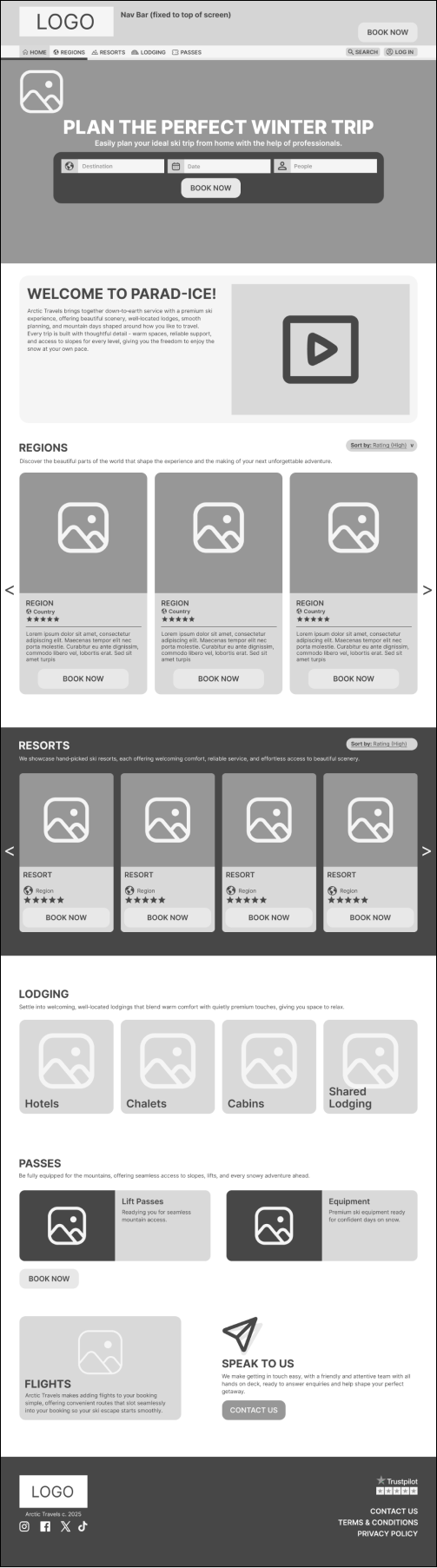
The landing page, where the user will be greeted with a hero image, introducing the intent of the brand and the first step to book a destination - this section is a nod to the aforementioned websites which have the same structure. Scrolling down, the user will next see a more in-depth introduction to Arctic Travels with a video reel of locations, for even more of a visual description.
Following this, we get to more of the clients requests - the Regions, Resorts, Lodging and Passes sections with call-to actions featured in carousels of cards and buttons with featured locations based on the most successful and trending locations, including star ratings to specify customer satisfaction and establish trust.
The page is rounded off with a section to prompt the user to contact the team with any enquiries - another request from the client. This call-to-action will link the user to the Contact page, where they can get in touch which ever way they prefer.
DESTINATION
The individual destination page, of which I have chosen to go for a region rather than resort as there is more potential groundwork that can peak the user’s interest. A hero image with the region and country for additional geographical information introduces the page, following a description and a video reel to provide further knowledge.
After this, we have a section introducing local sights and attractions, with a carousel of cards which will link the user to each individual attraction page on Tripadvisor, once again with their star ratings. To increase the customer’s trust and interest, following this section we have the Reviews section, showcasing a carousel of Review cards and total ratings with the average rating displayed.
With the customer’s interest attracted, I have introduced the associated Resorts section and card carousel in cohesion with the homepage, and the lodging buttons featuring the number of how many respective listings there are per category, giving the customer a gateway to move forward in the journey.

Booking
BOOKING
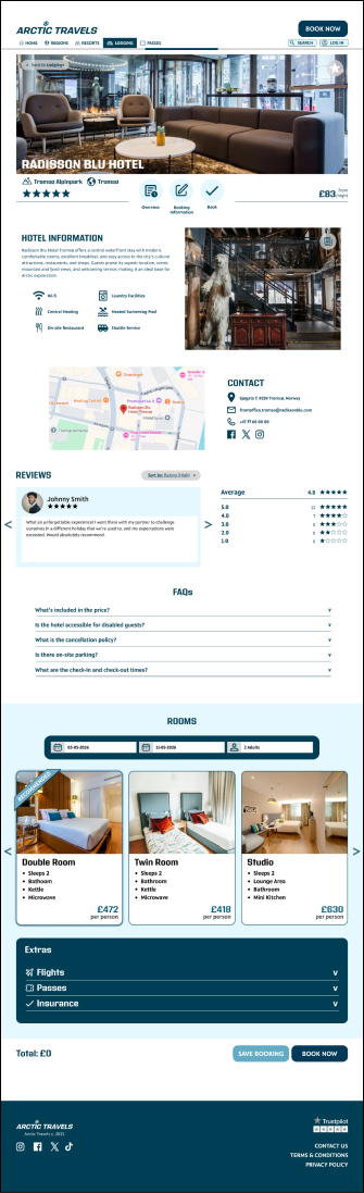
On the individual lodging page, this is what the customer will see. A hero image of the lobby or exterior of the lodging, with the name, region, rating and minimum price per night - all the necessary basic information, with navigation buttons to move to wherever they deem necessary on the page. There is also a favourite button to add the lodging to their wish list on the hero image, and a back button to get the user back to exactly the last page they were on, as some web browsers remove stored information and applied filters which is a painful experience for the user.
The section below is a brief overview of the hotel, with a description of the lodging and key features with icons, along with an image which can be clicked and act as an album, opening up a window which allows the user to browse through all associated imagery of rooms and facilities. Following this, there’s an image of the location on the map, and the contact information including social media icons. Below this is the Reviews section, featuring a carousel of reviews given to the lodging and the average rating with total ratings given. Finally in the overview section, is the FAQs which act as drop-down menus, and when clicked will display the answers.
Next is the booking information fields - when the customer fills in their check-in and check-out date as well as the number of people (adults and children), the room cards below will show the price of each room per person, as well as the features of the room. The customer can select their chosen rooms and either go to the payment screen, save their booking for later if they’re not ready to pay yet, or before doing so, add any extras in the form of flights, passes and insurance - none of these mandatory, but reduce the user’s need to look externally to purchase these necessities. The extras section also acts as drop-down menus, and when clicked will display input fields and information cards that the customers can select and add to their total at the bottom of the page with the call-to-action buttons.
PAYMENT
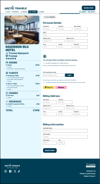
The page where the user finalises their booking. Once again, the user is greeted with the back button, and below, their booking information, broken down into appropriate sections with price breakdowns displayed next to each category, as well as the total at the bottom of this section. On the desktop UI, this information is on the left, giving the screen a split, so the user can keep their eyes on the total while moving down the page.
The customer then begins to enter their personal details, and then will be told how many loyalty points they will earn to spend on different items with Arctic Travels, or reduce the price of their booking. I have named these Snowflakes, fitting the theme of the brand. I have included the option for the user to choose to spend their earned Snowflakes to reduce the cost of their booking, but also given them the option to not do so, or to spend a specific amount if they don’t wish to use them all.
Then comes the final option to reduce the cost of the booking with the gift card or voucher code, which they can enter and apply to their booking. Finally, the necessary information - the terms and conditions notice and an option for the user to stay notified with updates from Arctic Travels in the future.
The customer can end their journey here and book using the express payment buttons, which on the mobile UI has more relevant options then desktop. If they wish to enter their details manually, they can enter their billing information below and book using the button at the end of the page.

CONFIRMATION
This page simply introduces a confirmation of the user’s booking, using a hero image of the booked location and “You’re going to *insert region*” to get the user excited, along with their booking reference number, check-in details, an a prompt that the user will receive an in-depth email with more information, along with the booking details repeated in the same fashion as on the Booking page. This is where the user journey ends.

Payment


Destination


Confirmation


DESIGN SYSTEM
Next, I created a design system based on the colours and typefaces I gathered in my moodboard, and elements I aimed to create for the wireframes of the 5 pages. I aimed to explain my choices for all of these elements in depth, their intended use and meaning. All visual elements have been provided with different variants and styles to be used where appropriate, and have been defined on their use for mobile and desktop interfaces.

COLOURS
My colour choices were inspired by the moodboard and the client’s request for cool colours, which is why I focussed on saturated and tinted hues. Rolling with the choice of the darkest blue, I wanted to make this the first primary colour style, and white the second, and display all shades between the two to create a scale. I defined each tone in between with their hex codes, as well as the intended use of the primary colour styles and I defined how they would all be used. Same applies to the secondary colour styles in the black and gray shades, and the tertiary tints inspired by the northern lights colour scheme - for these colours which I intended to use less, I made sure to define their roles in the designs and that the blue scale is the main point of reference. I also included two special colour styles to be used for the inputs, their roles and how they vary between successful and failed input attempts.
TYPOGRAPHY
Using the two typefaces on the moodboard, I laid them out in different sizes and weights and defined their intended uses for mobile and desktop, some of which would only be used on one device due to legibility and appropriate placement. Each typeface has an equal role - Address Sans Pro for bigger headings, and Comma Sans Pro for body text and appropriately placed subheadings. Each text style had been defined with an example of the text used, the name of the text style, the typeface, the size and the weight. These saved text styles ensured that the text on the wireframes can quickly be switched to the stylised versions.

BUTTONS
All buttons included in my wireframes have been created and defined between device interfaces, along with the dimensions as some buttons had been made to fit the column structures of the devices, particularly the mobile buttons as some stretch across the full column structure. Variants have been included throughout for different states of each button (e.g. disabled, hover) to showcase interactive aspects. The primary colour styles have been used for default states, and the secondary colours have been used for different button states appropriately. I wanted to provide anyone who had been given my wireframes an exact idea of what to do with them, mirroring the brand identity in these elements.
ICONS
I took all of the icons I included in each page of my wireframes and created them as components and categorised into their main appropriate use, so that they can be included from the Assets panel and switched appropriately.

CARDS
All cards which I intended to use on the wireframes had been stylised with colour, appropriate text styles and defined by their uses for both mobile and desktop. Some of which use multiple states and have included interactive elements. Colour styling and scaling are two very important factors to define here, as these cards need to sit perfectly on the carousels fitting to the column structures, as for example, the resort cards 2 to a page horizontally, and it’s important that the cards don’t take up more space in the structure than needed, and that’s why I also the cards are stylised properly to match the envisioned colour scheme in their sections.
Forms have been designed and defined between mobile and desktop interfaces, with variants created to highlight the inputted text, success of a completed field, and an error message to define when action needs to be taken. Same applies to the message box for contact pages. Selection Fields have also been included for fields which have a specific input type, e.g. the Date box will bring up a calendar, the People box will ask the user how many adults and children. Once again, scaling is important here for spacing reasons, which is why the field sizes have been defined.
INPUTS
I defined the grid systems for each device, using a full width dimension span of 402px for Mobile and 1440px for Desktop. 4 columns for Mobile and 12 columns for Desktop as standard, with margins and gutters defined in pixels too. This helps lay down a clean layout for the design and keep content spaced proportionately.
GRIDS


SCREENS
Now that the design system had been created, everything could be applied to the wireframes to create the final screens for the pages. Along the way, tweaks had been made to the content placement and spacing, as this stage highlights what works in black and white but doesn’t translate as well after styling. Adhering to the brief by sticking to the suggested colour scheme and making it cohesive amongst every page was the most important part of this stage, allowing my vision to come to life but more importantly, the client’s vision. It was also important for me to constantly refer back to my market research, making sure that my pages reflected the positives in the wesbites that were reviewed, and considered the action taken on the weak points of these websites to set this website apart from the rest.


Home


Destination


Booking
Payment
Confirmation




UX LAWS APPLIED
Throughout the process of applying the design system to my wireframes and refining the finer details, I made sure to apply a series of UX laws into the page designs to maximise user experience and cognitive function.
• Fitts’ Law - On the landing page, large call-to action buttons which occupy full areas of space, specifically on the mobile and still being within proximity of appropriate areas ensure that the user would quickly be able to make the decision to jump further into the user flow, and if more information is required, following sections of the page would have the same call-to-action, further tempting the user. Fitts’ Law also is applied on card carousels throughout the website, either encouraging users to learn more about the respective content or get stuck in and booking their trip.
• Miller’s Law - Not many buttons have been included in the navigation bar, no more than outside of the client’s request, and the landing page flow is broken down and spaced apart with room to breathe to ensure that the user doesn’t have to take in too many options and too much information in one small moment. This law also applies to the payment page, where cognitive overload can make the user wary of finalising the booking if too much information is to be stored and explained at once, therefore it has been kept a smooth and simple flow.
• Hick’s Law - Hick’s law applies to the pages in the same way that Miller’s law is applied - less options and less unnecessary content means more leeway for the customer’s brain to make a decision, and in this case, seeing a small amount of information at first can encourage the user to see more and achieve cognitive satisfaction, enhancing their chances of making a booking.
• Aesthetic-Usability Effect - Cool colour tones have been used throughout and black has been used only in moderation - the dark blue shade which acts as the brand’s staple colour achieves legibility for type and backgrounds in combination with white, but also keeps that Arctic feeling flowing through the entire website. Anyone looking for a skiing holiday will know exactly what this brand is all about and what it has to offer, an with the use of appropriate colours, fitting vibrant imagery and breathing space to cleanse the palette, the website achieves both aesthetic and usable statuses.
• Jakob’s Law - The interface being inspired by the leading competitors’ based on the client’s requests and vision along with the competitive research, Jakob’s Law was naturally applied to these designs, particularly on the Landing page which take heavy influence from Expedia and Booking.com’s landing pages, for example, when the landing page opens up and the option to book with the search fields being the first thing on the screen. These designs naturally reflect what a user would expect from the market, but optimised and inspired after the SWOT analysis had been conducted on competing brands and what Arctic Travels can do better than all of them.
• Law of Proximity - Relating content on all pages has been kept together in appropriate sections - on the mobile interface, related content is stacked vertically or horizontally on carousels, but either on a separate background colour or with a fair amount of white space to separate one section from another, and on the desktop interface, if not vertically, then horizontal white space separates one package of information from another.
• Law of Similarity - Mainly applied to card carousels, which match the colour scheme of the related sections, and when cards are repeated on other pages, still stick to the structure. Even in elements such as the nav bar and footer, repeated content on each and every page, the law of similarity is used from head to toe.
• Law of Common Region - Working hand in hand with the law of proximity, some content blocks have been kept in sections with a coloured background, or within cards, the latter of which are a natural example of common region use that can be made visually appealing so easily.
• Law of Prägnanz - There is a balance to be made with adding touches to making a design visually appealing and throwing too much on at once, and this interface achieves the balance well, with text being kept as concise as possible while still being informative, colour being used appropriately, and negative space used to allow sections to breathe. The law of Prägnanz is less to make an interface minimal and lacklustre, but to make sure that content is visually appealing while straightforward and simple, and that is a UX law that is always to be considered as it is here.
