
INTRODUCTION TO BRIEF
Green Earth is a clothing brand which aims to produce high quality sustainable clothing, appealing to an environment-cautious audience who wish to take their own steps to reduce their carbon footprint and reduce impacting environmental damage through their choices of where to buy their clothes. Green Earth’s objective is to produce clothing which is not only fashionable, but takes care of our planet in every respect of production, from creation to dispatch. The aesthetic of the brand is kept minimal, letting the message do the talking through earthy colours and materials. Overall, the brand’s message is "conscious fashion for a better planet."
BRIEFING THE PROBLEM
Living in a “fast fashion” era, which use non-degradable material, produce a lot of waste clothing and dispatch internationally in mass, Green Earth is a national brand that aims to contribute to a movement of recyclable clothing using organic materials, and is dispatched and delivered without the use of fossil fuels.
Above all, communicating the message behind the brand is the number 1 priority. The intention of producing eco-friendly clothing and adhering to the values which build Green Earth as a brand is what the target audience will notice and make them want to purchase their items of clothing. Heart and soul is what connects the user to the brand when it comes to a movement, and works in synergy with the e-commerce aspect and entices viewers to browse and purchase goods.
Alongside this objective, it’s important to stick within the brand’s aesthetic of minimalism with earthy tones. Being able to achieve a minimal aesthetic while still attracting the eye of the customer and keeping them interested is an art that can be achieved through sensible use of imagery, colour, type and white space.
MOODBOARD
With the details of the brief taken on board, the next step was to create a Moodboard including imagery themes, the target audience in mind, typefaces that would be appropriate, sample text that could be used and preview the typefaces in a relevant manner, and colours that would fit the aesthetic of the brand. I treat this as an exercise to put thoughts into visuals, assisting me for the next step of creating elements for the interface.

IMAGERY
For the imagery, I wanted to piece together a mix of elements for aesthetics, for the meaning, and for general clothing e-commerce. I began with images of the British countryside and some of the marvels of the country, fitting the vibe and also highlighting the care for the environment. And being all for our planet, I had to include an image of the earth. For the fashion element, I wanted to include some images of a rustic and authentic studio, which is a money shot for quality fashion, also eliminating the idea of factory/sweatshop style studios associated with fast fashion. Finally, images of models, and I wanted to include models outside of the standard image – different body types, gender identities, races, etc. Not only is it inclusive, but it’s a big passion of mine.
TARGET AUDIENCE
My target audience is all-inclusive, but with a focus on younger adults who are more awake to the state of the climate and willing to change their fashion habits for the good of the planet. This is also the more fashion-forward target audience, and while broad, has a lot to work with. This target audience appreciates minimalism and intention-first branding, although an important risk factor in my mind is to make sure that while adhering to a minimalistic approach, to still make the brand appealing to younger people
TYPEFACES
Immediately, I knew a serif typeface would be ideal for this brand for clear communication and honesty. Source Serif Pro jumped out instantly, working in its natural Regular form for body text and working in Bold for headlines and with the use of colour, goes from being too serious to having a personality and tying in with my vision of the brand. In addition to this, I wanted a second typeface to be used for the logo, so it’s not all one note, even though I absolutely knew I wanted Source Serif Pro to be the primary typeface. Courgette stuck out as a display/script typeface that would communicate an authentic vibe while still being legible – an issue that is generally faced with this style of typeface.
SAMPLE COPY
In order to see how the typeface would look in a relevant context, I wanted to use a few potential headlines that sprung to mind that highlight the brand’s message of balancing eco-friendliness with fashion. Buzz words such as “green”, “clean”, “organic” and “nature” lay down a descriptive tone for what the brand is all about, making them snappy is the second part.
An obvious first impression of colour choice is green, which I wanted to be the overall representative of the brand, symbolising nature, sustainably and eco-friendliness. After receiving feedback, it was agreed that a darker green would be more appropriate, working in harmony with pale tones in crystal clarity. White would be the partnering primary colour, as the brief makes it clear that minimalism is key. Second to that, I wanted to include different shades of green that would add layers of depth as accents/background colours in areas, but to be used in moderation. Thirdly, as alternative accent colours, woody tones that contribute to a different side of the “earthy” elements. Providing these as options gives a full picture, as I didn’t want to box myself in with just green and white – I wanted to provide complimenting alternative colours to give the potential to make a design possess more depth.
COLOURS
WIREFRAMES
I chose to create the low-fidelity wireframes for the Home and Checkout pages, showcasing how the colours, imagery, buttons and forms would all look. I based my layouts off examples of interfaces for clothing brand websites, and used these examples to gather inspiration of elements I’d like to take, and elements I personally would improve their interfaces and apply it to my own. Having a smooth vertical flow, showing the necessary content, and making sure to display enough but not too much for optimal performance were my priorities. From this foundation, I was able to pinpoint where all elements would go and focus on applying elements of visual hierarchy.
Home

Checkout

Home

Checkout

HOME
Nav Bar
Menu Buttons (including Search and Basket)
Basket Item
Cards
Totals and Subtotals
Delivery
Address Forms
Billing Address Forms
Delivery Options
Terms of Use
CHECKOUT
Discount Form
Payment Buttons
Hero Image
Clothes Cards
Social Media Cards
Newsletter Sign Up
Special Offer
Footer
KEY ELEMENTS
There were elements that I knew were required for both pages, some of which were needed individually or for both. I noted them down as follows.
VISUAL HIERARCHY
My idea for the flow of the pages is simple - clear imagery, headlines bigger than body text, and matching colours. The hero image prompts the Visceral reaction and peaks the user’s interest, so pairing it up with a big heading, relevant legible body text and buttons to continue their journey, opens the gate to a fulfilling UX. On the basket page, this is the user seeing items in their basket and excitement to purchase. This wireframe laid down the appropriate sizes for content.
ALIGNMENT
The mobile version had been set to a 4-column grid, and a 12-column grid for the desktop version, with dimensions of the columns, gutters and margins defined in the design system. This ensured that all content would be aligned in perfect symmetry, and some content would stretch along all columns to fill the space perfectly while having enough breathing space in the margins (example being buttons for the mobile version). The majority of text would be aligned to the left for a perfect horizontal reading journey – centred type would only be for particular subheadings without proceeding body text. Nav Bars would be fixed to the top of the page so the user would have full accessibility to the buttons while scrolling down, and on the Desktop Basket page, the basket window would be fixed to the left, so only the information on the right would be scrolling, keeping the basket items and totals visible at all times and really making use of space perfectly.
USER FLOW
Upon loading the website, the user will instantly arrive at the homepage and be greeted with the nav bar and hero image. From there, the user will be able to make their journey to any pages via the nav bar buttons, footer buttons, or prompts on the page - either buttons or “Browse More” cards on the carousels. The journey all comes back to the customer adding items to their basket on individual clothing pages and then making their journey to the checkout page, where they will be able to firstly make an account, or log in if they already have one, before filling in their information, placing the order, receiving their conformation, and then their journey ends.

INFORMATION ARCHITECTURE
My idea was to make the information architecture take place through the buttons in different sections, the nav bar and the footer being the main places as the fixtures of the pages (aside from the Checkout for the footer), assuring the user can have simple navigation between pages, and if the user wishes to jump further ahead if looking for anything specific, they can hit the search button and will be greeted with the results of their query, and can hit the individual result to jump to the corresponding page.
On the clothing category pages (Menswear/Womenswear), the user can apply filters to narrow their search (Product Type/Colour/Size) and also arrange their search results in order (New Arrivals/Most Relevant/Most Recent/Price: Low to High/High To Low). On the individual clothing page, they can select the colour and size they would like and add the item to their basket. They can either go straight to the checkout or to another page and keep the item in the basket for the time being.
Outside of the clothing and checkout pages, most of the pages have dead ends as they are there to inform the user, but making a purchase is the end goal. However, a secondary goal is that the user can be taken to the brand’s Social Media pages, from the Instagram card carousel and through the Social Media icons dotted around the site.
DESIGN SYSTEM
I created a design system based on the colours and typefaces I gathered in my moodboard, and elements I aimed to create for my wireframe. I aimed to explain my choices for all of these elements in depth, their intended use and meaning. All visual elements have been provided with different variants and styles to be used where appropriate, and have been defined on their use for mobile and desktop interfaces.


COLOURS
My colour choices were fully inspired by my moodboard, so I took them forward to the design system and defined them by their importance between Primary, Secondary, Tertiary and Special categories, and defined each colour for their particular intended use, considering all elements that would use type on the interface. Hex codes for the colours had been defined for each colour for full definition, but for quick colour changes to the wireframe, I made each colour into a colour style setting, allowing for colour changes in just one click. The headings for each colour are the titles of each colour style.
The primary colours were simple for me - the dark green shade I defined on my moodboard, along with black and white. These are the three tones I knew would be the bread and butter of my design, keeping to a minimal aesthetic. The secondary green colours were to add depth to the primary green shade, but to be used in moderation for accent colours, button states, and text areas where appropriate, but kept to a minimum. Same applies to the woody tertiary colours, but only to be used on particular pages where the imagery colours would match up. The special colours are strictly for forms, i.e. placeholder text and error messages - I kept this simple as I would rather keep to a standard form colour combination than risk legibility for aesthetic.
TYPOGRAPHY
I knew that Source Serif Pro was my choice of typeface from the moodboard stage, so I took this forward. Firstly, defining examples of copy using the name of font largely in different weights gave a 360 view of how they would look in different roles of type elements where they would be better in bold, with a stroke, or thinner, matching the surrounding content. Then, I created each style of headline and copy text, defining each example of each style, the style name, size and weight, along with their intended use for each device, whether headlines, for buttons, forms, or body text. I took into account the fact that small type would be perfectly legible on a mobile, and larger type would need to be used for the desktop version to avoid the annoyance of squinting or zooming in to read smaller type.


CARDS
I created the cards with the Home and Checkout pages in mind, and how they would fit into place in the carousels or fixed into boxes. Images being the focal point for both, while on the clothing cards, the article of clothing title proceeds, with the price being the last item in the hierarchy as it doesn’t require emphasis unless on sale. White was the clear majortiy colour for these cards, as for e-commerce, displaying information clearly with no distractions is key, especially for a minimalism-centric brand. The cards used on Menswear/Womenswear pages would be larger and follow suit with colour scheme and layout and reflect these designs, For the Instagram cards, they only require the image and caption, and the entire of the caption doesn’t need to fit as it entices the user to click and read more.
BUTTONS
The buttons have been created and defined between device interfaces, along with the dimensions as some buttons had been made to fit the column structures of the devices, particularly the mobile buttons as some stretch across the full column structure. Variants have been included throughout for different states of each button (e.g. disabled, hover) to showcase interactive aspects, and toggle buttons, checkboxes, drop down menus and icons have also been defined. The primary colour styles have been used for default states, and the secondary colours have been used for different button states appropriately. I wanted to provide anyone who had been given my wireframe an exact idea of what to do with it, mirroring the brand identity in these elements.


GRIDS
I defined the grid systems for each device, using a full width dimension span of 402px for Mobile and 1440px for Desktop. 4 columns for Mobile and 12 columns for Desktop as standard, with margins and gutters defined in pixels too. This helps lay down a clean layout for the design and keep content spaced proportionately.
INPUTS
Forms have been designed and defined between mobile and desktop interfaces, with variants created to highlight the inputted text, success of a completed field, and an error message to define when action needs to be taken. Same applies to the message box for contact pages.
The elements from the design system were applied to the wireframes to make the final screen designs for the Home and Checkout pages, both of which include their own Nav Bar fixed to the top and featuring the logo on the left, and the navigation buttons placed appropriately. The desktop version has a text-based button system, while the mobile uses icons for perfect clickability - the menu icon will load up an overlaying menu with text buttons to the respective pages. Adjustments were made along the way to make type, imagery and other elements fit together properly, but the structure of the wireframe was a clear guideline for placement of all content.
SCREENS


HOME
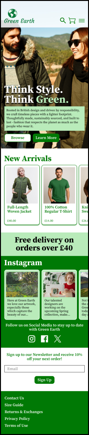
Triggering the positive visceral reaction is the number 1 goal with the homepage, while underneath the layers of what the customer sees, following the map of the user flow I created. This page I do believe achieves both of those things, introducing the brand to the user while also providing all the links I laid down in my user flow in different areas.
The hero image features both genders in stylish garments in nature, hitting the fashion and nature elements and appealing to both men and women. The “Think Style. Think Green.” Copy I came up with during the moodboard stage I saw as a snappy heading to catch the attention of the user and nail the elements of fashion and eco-friendliness. Proceeded by relevant copy text and a Browse button to lead to the e-commerce pages (a prompt would pop up asking whether to go to Menswear/Womenswear) and a Learn More button to lead to the About page, this section I believe achieves a mix of snapping the user’s attention, and providing a map to the next destination. Using drop shadows on the headline and a flat rectangle behind the body text helps both elements sit above the high quality image with full legibility, and while also applying a level of visual hierarchy by pairing up the background of the body text with the fill in “Green”.
Next up, I wanted a small preview of the New Arrivals section to appear in the first screen shot, to add another signpost for the user’s eyes by showing the products that the brand has to offer. Introduced with the headline and proceeded by a carousel with the clothing cards, the user gets a preview of the brand’s products, with another “browse more” prompt at the end of the carousel to lead the user to the e-commerce pages, once again prompted with a direction window between Menswear and Womenswear, and when directed, the page will automatically have the “New Arrivals” filter applied. This carousel will be scrollable horizontally on mobile, while the arrow keys on each side of the carousel on the desktop version will allow the user to click and show the next card along until they reach the end.
I wanted to follow this up with an appealing promo offer, and a free delivery offer is popular among my research, enticing customers to order a certain amount of goods to save money on delivery. I placed this below the carousel in bold writing and a pale background, for contrast between sections.
Immediately following on, we have the Instagram carousel, using the dark green background to section off the page and a white heading and icons. The carousel features the same number of cards as the New Arrivals carousel and functions the same way too. The icons end the section to provide the user with options to check out the other social media sites, not limiting the objective to just Instagram, although it has been emphasized as the platform that fits the brand’s visual-centric aesthetic.
For one final call-to-action which provides the user with another incentive to shop and allowing the brand to collect more information, I wanted to include a small Newsletter Sign Up without making it too flashy, as I wanted the other areas to do the heavy lifting and not throw too many big elements on the same page. I kept the type at a reasonable size with a form for the Email submission and button.
Finally, the page is wrapped up with the footer, which uses the token green background and white text-based buttons which add in the remaining planned pages in the user flow. These never have to have any emphasis based on my research, but of course have to be included, so I kept this simple to round off the page.


CHECKOUT
The most important thing with the Checkout page is to follow the user flow of the journey between entering the page and placing their order - a confusing interface can easily make the user give up and a potential order would be lost. This page would follow a customer choosing to end their browsing session and creating an account first, which is reflected on the user flow. They will then end up at this page.
The main difference between interfaces is the layout - both are scrollable, but the mobile interface allows the user to scroll all the way to the bottom, while the desktop interface has the basket items fixed to the left below the nav bar, and can scroll down to the Total price. Where the green background stops is where that section is no longer scrollable, while the information in the right scrolls down to the bottom where the final Pay button is.
Starting with the Basket items, which have the point of view of the customer about to be in possession of the goods that the customer is excited to buy. In case they do change their mind, I have fixed an icon in the top-left corner of each card to allow the customer to remove an item. At the bottom of the cards is the subtotal price of the items, before delivery charges and discounts have been applied. If over £40, the customer will be entitled to free first class delivery, linking back to the promo offer on the homepage, and this will be reflected in the discount. On the desktop version, the total price is also displayed in bigger text for emphasis, and will be updated with the Delivery and Discount sections while the customer enters in the necessary information throughout the page.
Introducing the form sections is the delivery information - you can’t place an order without knowing where the package will be going. Each form box has an appropriate amount of space for the respective content. Address Line 2 and County boxes don’t need to be filled in, but provide extra necessary information for the brand to know where the package is to be delivered. The other forms are mandatory and will flash with the error messages underneath them if not filled in correctly.
Next is the delivery option section, which only has two options. Only one box can be clicked and the price will apply to the final total. The over £40 spend for free delivery offer only applies to the first class delivery option - next day delivery will always be accounted for in the price.
Following this, we have the final option of deductions - discount codes and gift card codes, which the customer can enter and apply with the button. If invalid, the form will display an error message, while if approved, will switch to the success variant.
Then we have the mundane, but necessary pieces of information that are generally included towards the end of a checkout page - the Terms of Use information and an option to stay up to date with the brand’s ongoings. This box doesn’t have to be checked for the customer to checkout, but gives another opportunity for the brand to store information and keep customers interested in coming back. The Terms of Use is linked on the respective words, and when clicked, will open up a window with the relevant information.
Following this, on the mobile version, the total is displayed, and on both, the express third party payment options are displayed. The customer can end their journey here. In a world where people would much rather not repeat filling in the same information, this is a surefire hit with UX, getting customers to their goal posts faster, and I provided a few options - Apple Pay being the most popular with iPhones being the standard device for mobile use, but Google follows for Android users and then for both devices, Klarna for buy-now-pay-later utility an PayPal for an alternative express payment option.
Should the customer not want to take any of these options, they can enter their billing address and payment information below, before hitting the Buy button. Once again, Address Line 2 and County are not mandatory fields, but the rest on Billing Address and all fields on Billing Information are. The placeholder text in the fields is to assist the user in what’s required for the field, and in the case of Billing Information, how many digits for the number fields. A large amount of people forget what the 3 digits on the back of the card are called, so this provides assistance.
Following the purchase, the customer will reach an order confirmation page and receive an email with the same information, and the customer’s journey reaches an end point.
UX LAWS APPLIED
I applied a series of UX laws to my design, taking into account different design techniques which improve the user’s experience by attracting their attention, keeping them engaged, and developing a sense of trust through careful and sensible design choices.
• Fitts’ Law - Bigger headlines and buttons are more significant, triggering a quicker response.
• Miller’s Law - Cards used for a carousel rather than displaying too many at once.
• Hick’s Law - Homepage has been kept simple to not overload the user with choice. A good balance of brand communication, examples of clothing, and social media info for variety, along with a promo offer for extra enticement to get stuck in is all that’s necessary.
• Aesthetic-Usability Effect - Green is a prominent colour and imagery has been made big and eye-catching, setting the tone perfectly.
• Jakob’s law - This UI has been inspired by my research of interfaces used for popular clothing brands, both format and structure.
• Law of Proximity - Buttons are kept in sections, cards are kept in sections, headings and type are kept together, and sections are rounded off with either space or colour, where appropriate.
• Law of Similarity - On the mobile the nav bar icons are the same size and colour, nav bar page buttons are the same on the desktop, search and basket are the same size but inverted for emphasis, and all card families are different to one another so each carousel has its own identity.
• Law of Common Region - Sections are either contained by a nav bar and on the homepage, a hero image, or sectioned off in a background/box.
• Law of Prägnanz - Mainly applied to checkout pages, for full clarity and a smooth journey to payment.
