
INTRODUCTION TO BRIEF
MEALMONK TEAM
Doug Djuritschek
Kofi Brenya
Georgia Ejihritobo
Jessica Soares
Nelia Bunkete
The goal of this project was to create a mobile app that helps busy families plan meals, create grocery lists, and track what they have in their pantry. The app needed to be user-friendly, allowing users to search for recipes based on ingredients, dietary restrictions, and preferences, and providing a grocery list that can be easily modified and organised. These are the main guidelines for the app, making meal planning and grocery shopping easier for everybody.
BRIEFING THE PROBLEM
Making a meal planning and grocery management app comes with a lot of potential framework, but making sure that it’s easy to use and easy to organise is the priority - too many features in the same place an cause user fatigue and defeat the objective given. Using the double diamond method, gaining an insight into the target market is needing that they aren’t getting from the competing apps ensured that our app considers different users with different needs.
Our target users: Households, primarily busy families, although it’s important to make sure that households without children are also considered rather than centring the app around the needs of children. Making sure that the features of this app are applicable to individuals in general who don’t have enough time on their hands to keep track of their food stock is key.
The problem they are facing: Busy adults are wasting too much money and food by buying products they already have because they don’t have the time to constantly check their pantry, especially in situations where no household members are present to check their food stock and only have time to pick up groceries on the way home from work. Using recipe websites and apps that don’t automatically synergise with food stock means that the average person will either buy ingredients they didn’t need, or assume that they had said ingredients when they needed to be stocked, giving the need to use up valuable time going back out of the house to get extra groceries. Alongside this, the “what shall we have for dinner?” question is more exhausting than one would imagine, and takes so long for the average person to answer, can be made much more simple.
The goal they are trying to achieve: Being able to manage food stock, quickly curate shopping lists and reduce valuable time being spent browsing through supermarkets, and all the while, saving money and reducing food waste. An app which factors in food stock, dietary requirements, a shopping list that is easily organised and can optimise the user’s shopping experience, would be nothing more than a household staple that the people are wishing for.
We understood that Meal Monk needed to be an app that was able to solve our users’ problems and pain points - in order to do that, we needed to conduct research that would help us better understand our users and allow us to come up with effective solutions. First, we identified our users' main pain points. Our users were experiencing difficulties with time management, keeping their pantries stocked, planning meals and creating grocery lists. Identifying these pain points was key to our decisions about what kinds of research to conduct, how to conduct it and why these methods may best suit our users. Then we came up with three questions that would frame our research and how it could be applied to our design process. These questions were:
• What are users struggling with?
• Why are users struggling?
• What do they think they need?
After deciding on a set of questions to frame our research aims, we decided on several different research methods that we would use to gain insight. These were an online survey with 15 participants, short user interviews with three parents/potential users and online research conducted by collating data from Reddit communities, media publications and market behaviour. Each method allowed us to create a clear picture of our users' needs, wants, and problems and helped to create key solutions to enable an effective design process and an app that was user-friendly.
Our online survey was conducted by selecting 15 participants who were sent a Google forum link with a set of questions. These questions were a mixture of multiple-choice questions and short forum answer questions, the latter of which users usually gave one or two sentences as an answer. We decided to isolate some of the short-form answers that best reflected the overall needs, issues and solutions given by participants. The questions were split into four sections: Habits, Behaviour, Pain Points and Needs. The structure of the survey allowed it to be the most insightful research method. Users were also anonymous, which allowed for answers to be freely given, which may have been a limitation with the interviews.
Our short user interviews involved asking three parents/users open questions about their current habits and issues around meal plan and or grocery shopping. We made sure to frame our questions to best understand what users would need and want from an app like Meal Monk. We also want to gain insight into how their kids, childcare or the stress of maintaining a household may bleed into their ability to plan meals and grocery shop effectively without asking leading questions. Keeping questions simple and open-ended allowed us to get the best answers out of our interviewees and ensure that those answers had the detail and authenticity that would help us build an app centred around users.
USER RESEARCH
by Georgia & Jessica


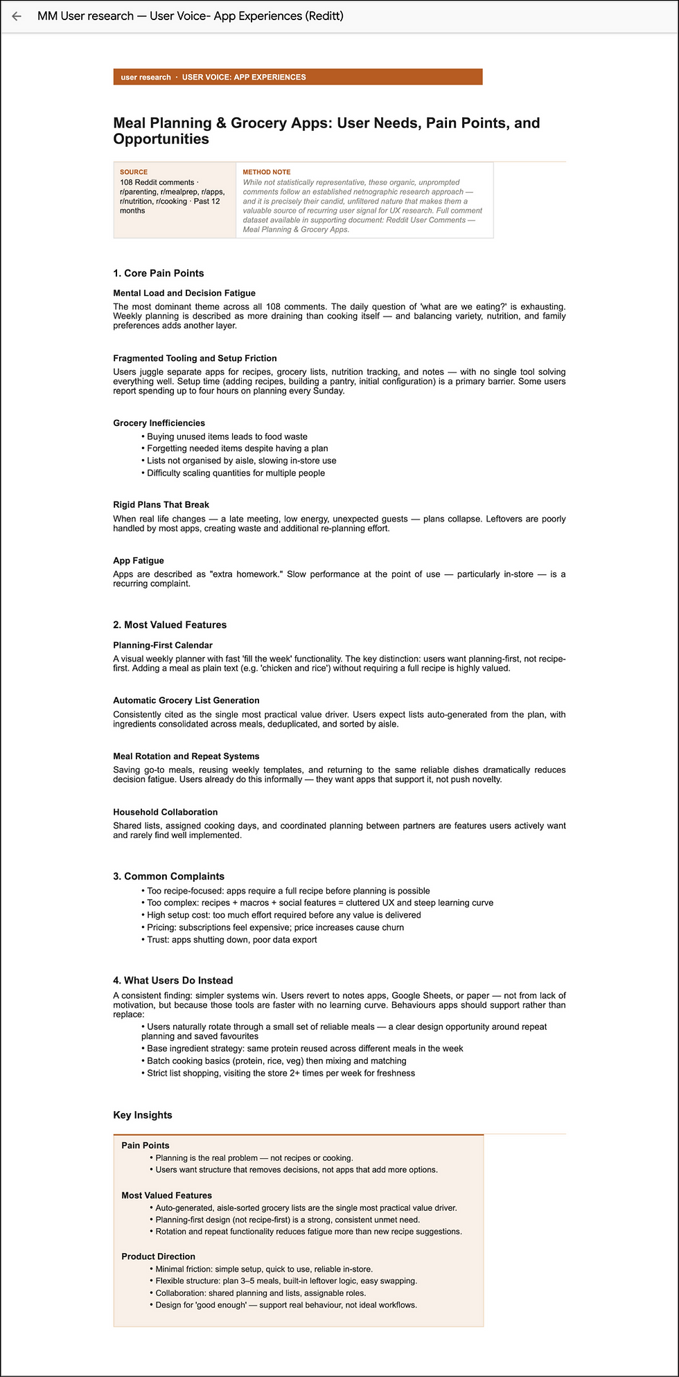
REDDIT USER RESEARCH
USER RESEARCH REFERENCES
SECONDARY RESEARCH
Good design starts with knowing your user. Here is what the research says:
The Data: Using published reports from credible sources, we gained insights into the market dynamics and behaviours of UK families. This is not background reading - it is an evidence base that can validate all the other assertions. The findings are behavioural patterns observed across tens of thousands of UK households: a shift towards list based shopping, a decline in meal-prep time, and need for quicker/ less complex meals. All done with traceable, credible sources. Key findings: meal planning has quietly become a financial necessity and organisational demand.
The Users: a netnographic analysis of unprompted Reddit comments across five meal planning and parenting communities (r/parenting, r/mealprep/, r/apps, r/nutrition, and r/cooking. This method was chosen to capture unfiltered user behaviour, something you may not get in formal surveys. It showed consistent patterns: decision fatigue is the dominant paint point, current apps add more friction then they remove, and users are still going back to Google sheets and paper because current apps feel like too much work. What they need is not necessarily more features, it is less thinking.
The Conversation: Editorial analysis from 6 UK lifestyle and parenting publications (from the past six months) - the exact sources our target users turn to for advice on what to buy and download, which makes their articles a reliable signal of real user needs and priorities. The key findings: Food waste, collaboration, and end-to-end convenience are no longer selling points - they are expectations.
The research is consistent: families are not short of apps - they are short of one that genuinely fits around their life.
ONLINE SURVEY
Section D: Needs - Users understood what solutions would work best for them, suggesting that features like an automatic shopping list, meal plans and something to make things like meal planning or grocery shopping much simpler.
What would make meal planning easier for you? (Short answer please)
“A meal plan or shopping list made for me and my needs”
“Automatic shopping lists”
“Something to make it quicker and simpler”
“Meal ideas based on what I like”
Would you like to use an app that combines meal planning and shopping for you?
Yes
Maybe
No
Data/Outcome: Yes (10 users), Maybe (4 users), No (1 user)
Section C: Pain Points - Users struggle heavily with time management, balancing grocery shopping with managing their kids and making choices. They need something that takes less time, is simple and streamlines choice.
What would you say is your biggest challenge around meal planning and food shopping?
Lack of time
Deciding what to cook
Budgetting
Forgetting items
Dietary Needs
Data/Outcome: Lack of time (6 users), Deciding what to cook (4 users), Budgeting (3 users), Forgetting items (2 users), Dietary Needs (0 users)
What frustrates you most about food shopping? (Short answer please)
“Forgetting things and having to plan to go back or work around missing items”
“It takes too long, and I often don’t have time to do it, especially not after work”
“Not knowing what meals to plan”
“Overspending”
“Shopping with my kids is very stressful”
Section B: Behaviour - Users struggle with remembering things like food items, making a grocery list, or having time to pre-plan. They would need features that would be consistent and help them remember.
How do you currently create your shopping lists?
Notes app
Paper List
Memory
Meal Planning App
Data/Outcome: Notes app (5 users), Paper List (4 users), Memory (3 users), Meal Planning App (3 users)
Do you usually forget items when shopping?
Often
Sometimes
Rarely
Never
Data/Outcome: Often (6 users), Sometimes (7 users), Rarely 2 users), Never (0 users)
Section A: Habits - Users are currently rarely making choices about meals and grocery shopping ahead of time. This suggests that they may benefit from pre-made shopping lists, recipes and meal plans.
How regularly are you planning your meals?
Daily
2-3 days ahead
Weekly
Not at all
Data/Outcome: Daily (3 users), 2-3 Days Ahead (6 users), Weekly (4 users), Not at all (2 users)
How often do you do a food shop?
Daily
Multiple times a week
Once a week
Data/Outcome: Daily (1 user), Multiple times a week (5 users), Once a week (9 users)
How regularly are you planning your meals?
How do you currently create your shopping lists?
What would you say is your biggest challenge around meal planning and food shopping?
Would you like to use an app that combines meal planning and shopping for you?
Do you usually forget items when shopping?
How often do you do a food shop?
6



Interviews

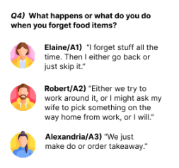


Elaine
(Parent with 3 children)
Robert
(Parent with 1 child)
Alexandria
(Single working parent)
Our short user interviews gave us more personal and detailed insight to how users may use our app and what their current concerns were. Users told us about how they struggled to plan meals ahead of time, how they currently create their shopping lists, how they had a strong desire for simplicity and automation. They pointed to decision making and fatigue being major frustrations. They also felt that the current tools they used were often too basic or complex and want something better suited to their needs.
Interviewees:


RECOMMENDATIONS
We should delve further into what our competitors have done to solve similar issues/pain points that our users have experienced. We need to consider how our users’ children affect the choices their parents make. To keep things simple, users frequently reported not having time, patience or desire to make complex decisions. Make sure that users' choices feel intuitive to them, for example, recipes matching what they have in stock, and the app keeps track of what they already have or what they may need.
COMPETITIVE RESEARCH
by Kofi
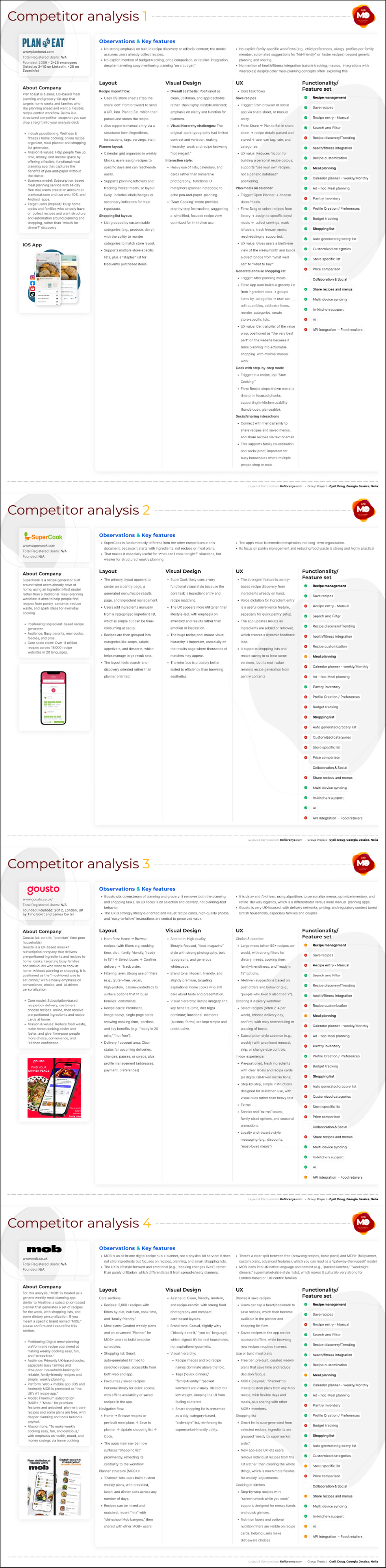
This competitor analysis, comparison table + SWOT exercise is basically our cheat sheet for building a better product, not just a prettier one, not taking away Nelia’s contribution…
Here’s why it’s actually useful (and not just project work) - you can see the “shape” of the market at a glance.
Now you know who’s doing what:
• Plan to Eat = the organised planner nerd.
• MOB = fun UK recipe hub + weekly plans.
• SuperCook = “what can I cook with this random stuff?”
• Gousto = “don’t plan or shop, just cook.”
That makes it much easier to explain where you sit in that landscape.
• It shows us the gaps we can own by lining up features and doing SWOTs, we can clearly see what nobody is really nailing: proper budget tools, price awareness, store‑specific lists, family profiles, and grocery integrations. That’s our opportunity to say: “Our app is the one that actually understands families’ time and money.”
• It stops us from copying the wrong things, because who wants that? Our competitors are successful despite clunky flows (e.g. heavy, calendar‑y planners) or confusing visuals. Having this analysis means we can borrow the good (e.g. MOB’s friendly tone, SuperCook’s pantry logic) without importing their pain points.
• It gives us a clear product story instead of “we’re a meal planning app,” we can say something like:
“We help busy families plan realistic weeks, stick to a budget, and shop smarter, using their pantry stock and the recipes they actually want to cook.”
This story is grounded in real gaps we’ve seen, not guesswork.
• It helps us prioritise what to build next (nice to have and talk about in a interview) with the feature matrix and SWOTs, we can sort features into:
- Must‑haves (planning, lists, sync).
- Nice‑to‑haves (basic discovery, nutrition labels).
- Differentiators (budget view, pantry‑aware planning, retailer links, AI‑generated weekly plans).
That makes roadmap conversations way less fuzzy.
It gives us ready‑made slides for stakeholders we basically already have: competitor cards, a feature grid, and a clear summary of opportunities. That’s everything we need to walk a PM, founder, or leadership team through: “Here’s the space, here’s what’s missing, here’s where we’ll win.”
In short: this isn’t just a long doc of what others do. It’s our design and product compass for building something that actually fits busy families’ lives better than what’s out there, BoooOOOOOooooom!


USER PERSONAS
by Kofi


The four personas (Jessica, Brian, Rajan, Suzy) are useful because they give Meal Monk app design a realistic picture of the different types of users you need to support. Instead of designing for a generic “busy family,” you now have four clear user profiles with different routines, priorities, frustrations, and technical comfort levels.
Together, they helped us identify the app’s most important requirements: fast meal planning, shared grocery lists, pantry tracking, ingredient-based recipe search, and simple, low-friction usability. They also show that the app must work for very different household situations, including parents with young children, a single parent managing health restrictions, a shift-working professional couple, and a shared-house lifestyle.
Their usefulness is also strategic. They help us make better design decisions, prioritise features, and justify why the app needs flexibility, collaboration, and personalisation. For example, Jessica highlights family scheduling and kid-friendly planning, Brian shows the need for gluten-free filtering and budget sensitivity, Rajan reinforces time-poor professional use, and Suzy reflects group collaboration and vegan meal planning.
In short, our personas shape our research into something actionable. They give us a user-centred foundation for designing, testing, and refining Meal Monk app that feels genuinely helpful to different households rather than one-size-fits-all.
USER FLOW
by Doug & Nelia

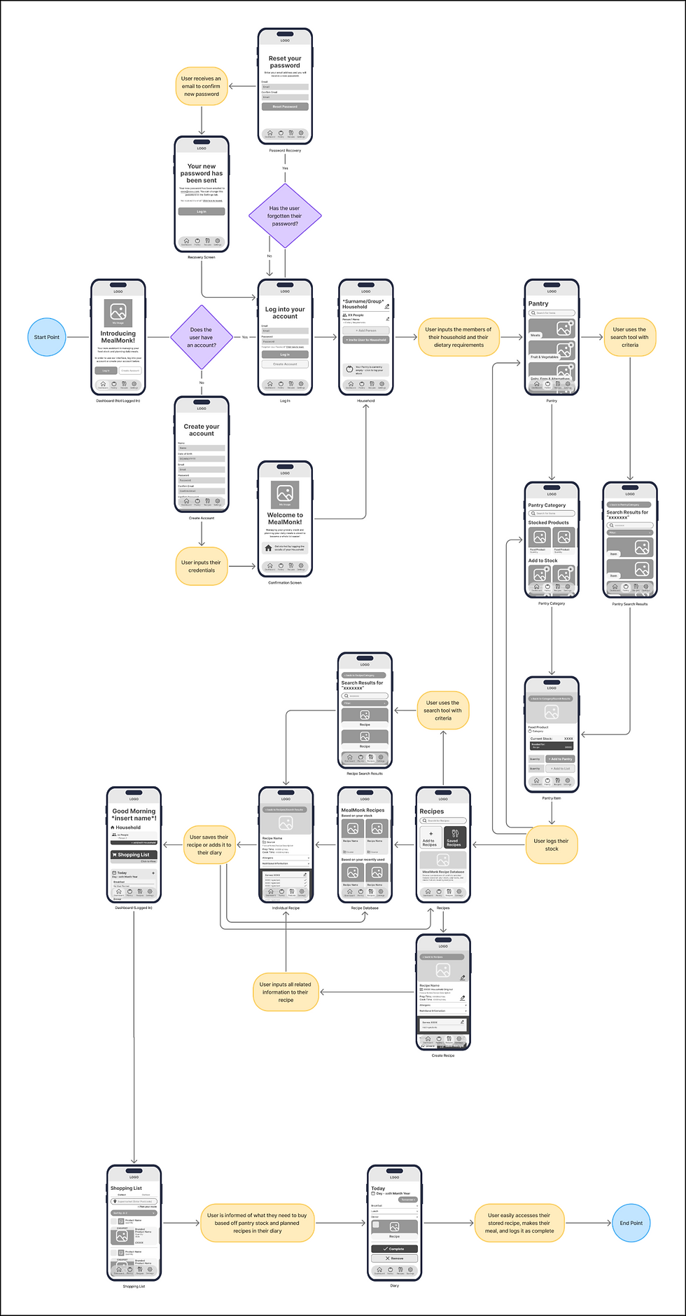
The journey of the user flow is simple - Account Creation > Household Addition > Pantry Stocking > Meal Planning > Shopping > Making the meal. The priority of the app is to help people who live busy lives and struggle keeping on top of their food stock and meal planning, and this user flow guides a first time user through the process. Starting off by creating an account, the user would then input the members of their household so that the app can use recipe servings as a default setting that matches the number of all members to feed everyone.
From this point, the user can start adding the contents of their pantry, adding each product quantity and jumping back to the respective food category so that they can cover the kitchen area by area. They can also add stock to their shopping list manually on these individual product pages if they would still like to obtain them even if they’re not used for the recipes they’re planning on making.
After this, the user can then make steps to plan their recipes, as the AI integration can suggest recipes that use the stock the user has logged into their pantry. They could alternatively choose to create their own recipe, adding layers of customisation to the experience. They can choose to either save recipes for easy accessibility, or add them directly to their diary, which will in effect update the shopping list with any ingredients they need if they pick a recipe they aren’t yet fully equipped for.
Now that the user has logged their stock and has planned their meals, the user’s shopping list is updated with the ingredients they need for these meals, as well as any other products they logged onto the list via the pantry. The user will have the option to collect their groceries personally or to get them delivered, however to satisfy the user personas who prefer not to use delivery services for factors such as saving money on delivery fees and having full control over the goods they select, this user flow focusses on in-person grocery shopping. The user can select which supermarket they’re planning on visiting, which will in effect suggest recommended products to purchase, highlighting the best deal the user can get, as well as their located aisles to optimise the customer’s shopping time, saving them browsing for longer than they’d prefer. This is a feature used by Trolley.com that integrates AI to solve mundane issues that in-person shopping carries, and in effect, making the user’s shopping experience a whole lot easier. The user doesn’t have to select which products they’d like to buy if they want to see the stock in person and make their mind up, although if they do, then the prices of the products will accumulate to a total price, giving the user the heads up on how much money they’ll be spending. The user then logs their items as complete once their shopping has been obtained.
The final step is the user accessing their recipe on the diary screen, accessible from the dashboard. This gives the user quick access to what they need to make and the method involved. Once the meal has been created, the user can mark the meal as complete, automatically amending the stocked items in the pantry and ending the user journey, leaving the user with complete confidence in using MealMonk for all of their meal planning and pantry management needs.

INFORMATION ARCHITECTURE
The three key sectors of the interface are the Dashboard, Pantry and Recipes sections. Each of these pages play pivotal roles in the user flow, and each screen branches out to different screens which have roles in the user flow. I created this information architecture chart to structure the flow of how the wireframes would look for these sections and all branches linked to these sections in order to establish a flow that is as simple, structured, and user-focussed as possible. Creating a balance between including necessary features and not overloading the user with too many options is a very important factor to ensure that users aren’t easily fatigued, as this is an issue that is faced by users as gathered in the research. Simply laying down the plan for the wireframes in this chart has established which areas of content are going to be displayed in a manner which makes sense, and visual hierarchy can be applied to elements to emphasise important features and guide the user further into their journey.
WIREFLOW
by Doug
Using the user flow and information architecture, I created the wireframes for each screen included for a full visualisation of the journey the user would take. These wireframes were fully designed using the information architecture as framework, although these screens here show previews of how the screens would look on a mobile device. Each screen has a logo bar fixed to the top and the nav bar fixed with a small margin of space from the bottom, framing each screen with perfect consistency.
MealMonk’s aim is to take the features that apps such as SuperCook lack in meal planning features, while also keeping the aspects of grocery management. Inspired by Plan To Eat’s structure, planning is priority for MealMonk, with references to the Pantry and adding recipes to the diary automatically adding required ingredients to the Shopping List, which has a clear place on the dashboard, while the links between the main functions of the app are included on the dashboard. One thing that competitors struggle with is the reliance on subscriptions in order for features to be fully available - MealMonk capitalises on the crowd who will get all of these features without the need to pay.
DASHBOARD (LOGGED OUT)
The landing screen, the first thing the user sees upon downloading MealMonk. The initial screen is filled with an image of Mo, the MealMonk mascot, and a welcome introduction to the app, with two calls-to-action signalling to either log in or create an account in order to properly use the features of the app, although they can scroll past this screen to get a preview of the interface to see if it’s right for them - this is a big assistance to the UX of an unfamiliar user who would often turn back at this step.
LOG IN
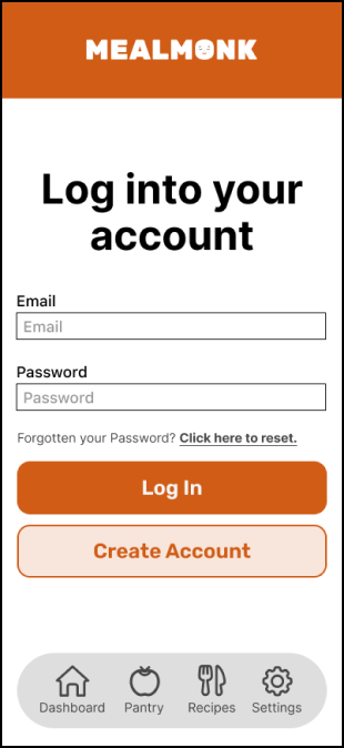
The screen where the user would enter their email address and password to log into their account, giving them full access to all of MealMonk’s features. If the user has forgotten their password, then they can click the underlined link to begin the password recovery process.
PASSWORD RECOVERY
The screen where the user would enter their email address to receive an email with their new password - this will be triggered when the user clicks the Reset Password button.
RECOVERY CONFIRMATION
The final screen in the password recovery process which confirms that the user will receive an email with their new password and that they can change this password in the settings tab on the Nav Bar. Another handy UX trick is that the user can request an email if they haven’t received it instantly/within a few seconds. This would not change the state of the screen, but trigger the email to be resent.
CREATE ACCOUNT
The form where the user would enter their details to create their account, with confirmation boxes for the email and password so that the user can be sure that they have entered the information correctly and minimises potential login issues. Clicking the “Create Account” button would trigger a confirmation email to be sent to the user as well as linking to the next screen.
ACCOUNT CONFIRMATION
The screen alerting the user of successful account creation, and that they can start taking advantage of MealMonk’s features to the fullest. From here, the user can jump to the dashboard, start logging their pantry stock or browsing recipes, although the most important first step is logging the details of the household so that any features automatically accommodate for the members accounted for, and that’s why a prompt is on the screen directing the user to this step in the user flow.
HOUSEHOLD
The household screen is introduced with a customisable name for the household so that it can feel that bit more homely for the users, and below that, the number of people in the household, the names of said members and their dietary requirements. When the edit button is clicked, the user can edit these elements, and below are the buttons to add members to the household either manually or interactively - the interactivity of household members all being able to pitch in, accessing their pantry, planned recipes and shopping lists makes MealMonk a household staple that benefits units such as parents and professionals who work different hours, cutting out the middle man of having to ask to update a shopping list. Whenever the shopping list would be updated, other members of the household would receive a notification that would link the user directly to the shopping list to assess. If the user hasn’t already logged their stock, which at this stage of the user flow they won’t, a prompt will end the screen directing the user to the Pantry section to start stocking their products.
PANTRY
The screen which introduces the Pantry section with stacked horizontal cards signifying food categories, in this situation being arranged by frequent use. The add button in the corner of each card tells the user that this is to add to their stock. The user can also search directly for items using the search bar, which when criteria is entered, sends the user to the search results page, only applying to content within the Pantry section.
PANTRY SEARCH RESULTS
The search results of the criteria the user entered, with results being displayed in a stack of horizontal cards arranged in order of relevance. The user can further their results by applying filters just above the cards, and if they wish to make a different search, there’s another search bar on this page, and if they wish to step back, there’s a button at the very top of the screen.
PANTRY CATEGORY
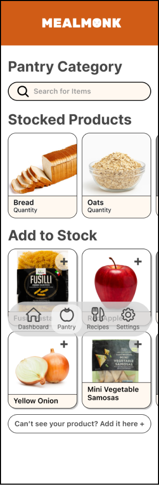
From the pantry page, when a user selects a category, this is the screen that would appear. Once again, the user if given the option to search for specific products only in this category, and below, their stocked products are first displayed in a scrollable carousel, and below that, the stock they currently don’t have in a larger 4x4 horizontal carousel setup. These cards are arranged in order of frequent use.
PANTRY ITEM
The page for each food product will be introduced with a hero image of the product, the name, category, and the back button to jump straight back to the respective food category to continue adding to the same space easily. Following this is the window with the current stock of the item in the appropriate measurement (e.g. grams, litres, etc.) and if the stock is needed for a recipe in the diary, the amount needed will display below the current stock in a darker window as a call-to-action. Finally are the fields to add a specific quantity of the product to their pantry stock, and the same field to add to their shopping list. If the product is already on their list, the user will be alerted and asked if this is a duplicate before confirming, so that there is no room for mistakes. If this product already stocked, another field would appear in between these fields with a “remove” button so that the user can manually update the used stock, although on this wireframe example, this field is not needed.
RECIPES
The landing screen for the Recipes section, firstly being introduced with a search bar so that the user can search for specifics. Below that is the Add to Recipes button where the user can create their own recipe, and the Saved Recipes button which gives the user access to recipes they have saved through either the database recipes or recipes they have created. These have been placed first so that the user can easily access their own recipes of interest. Below this is the button for the MealMonk Recipe Database, which will take the user to popular recipes which MealMonk has selected from different sources.
CREATE RECIPE
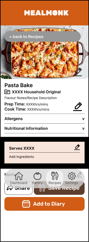
When the user clicks the “Add to Recipes” button, this is the screen they will be greeted with. This screen is entirely customisable, with edit buttons next to all fields, as well as a back button in the hero image which they can also customise. Following this, the name of the recipe, description of the recipe and prep/cook times can also be edited, with the source below the recipe name being stated as an original of the household name given by the user. Below this, the allergens and nutritional information can be clicked as drop down menus and the user can input the necessary information they know. Next is the servings and ingredients which can be edited and the stock will interact with the pantry the same way that stored recipes will, making use of MealMonk’s clever AI tools. Finally, the user can add the method to the recipe and how the meal is created, step by step. The screen ends with the user being able to either share the recipe on social media or through text, a button to save the recipe, or to add the recipe straight to their diary.
RECIPE SEARCH RESULTS
The search results when applying criteria to the search bar anywhere on the Recipes section, diving deeper into respective categories for specific items. All of the same filters and buttons are the same as on the Pantry search results, including the option to add filters to their criteria, the option to search again, and the option to go back to the last page.
RECIPE DATABASE
When clicking the MealMonk Recipe Database button on the Recipes page, this is the screen the user will be taken to. Each category features a subheading and a carousel of recipe cards with the name of the recipe and the source. Algorithms play a vital role across all apps examined in the SWOT analysis, which is why recommended recipes play a pivotal role in MealMonk as a quicker route to adhere to the tastes of the user personas created in the research stage. Prioritising recently used recipes and recipes based of stock hits the notes of the user accessing recipes they enjoy and recipes that can make use of their stock, minimising food waste and saving them money in the process. Following this are popular recipes of different cuisine categories, healthy recipes, allergen friendly recipes (these will be bumped up closer to the top if one of the household members has a specific allergy/intolerance), quick and easy recipes and breakfast/lunchtime favourites.
INDIVIDUAL RECIPE
The screen displaying an individual recipe, whether it’s from the database or one of the user’s saved or created recipes. A button for the user to jump back to the last page sits over a hero image of the meal, setting the scene for the recipe. Following this, the name of the recipe, source, description of the recipe and prep/cook times are displayed. Below this, the allergens and nutritional information can be clicked as drop down menus. Next is the servings and ingredients which can be edited if the user only wants to feed one person if the other is out, or if they have guests over for dinner and this will automatically adjust the recipe to how much of each ingredient they’ll need. Next to each ingredient will be an indicator (tick/cross) as to whether the ingredient is stocked, and when this recipe is added to the diary, these ingredients will automatically be added to the list. Finally, the user can see the method to the recipe and how the meal is created, step by step. The screen ends with the user being able to either share the recipe on social media or through text, a button to save the recipe, or to add the recipe straight to their diary.
DASHBOARD (LOGGED IN)
This is the updated dashboard screen now that the user has logged in, logged the details of their household and their pantry. This screen is introduced with a warm welcome message, followed by their household details with a link to amend, and the link to their shopping list below. Having the latter on the initial screen is crucial as one of the key features of the app. Below this are the diary cards and links - on the larger cards used for the present day and the next day, the logged recipes for the respective meals are displayed, while the smaller cards display a tick/cross to indicate if a meal has been logged. The small cards are part of a carousel which display the following 5 days, giving a week-long span, although this section is ended with a button that gives the user the option to plan for custom dates in the future.
The next section is the other necessary dashboard links - one to log any leftovers from meals to be used for meals on following days, and another to access saved recipes. The leftovers feature is a very clever feature used in competing apps where users can minimise food waste even further and plan to either use them for another daytime meal or freeze them and store them for use another day in the future.
The next item in the section are recommended recipes based on stocked products and recently used recipes, providing a shortcut from going to the Recipes page. These cards, like on the Recipe pages, are displayed in carousels.
The final element of the dashboard is one of MealMonk’s USPs - Ask Mo, the MealMonk mascot. Ask Mo uses AI to further the experience of a busy user, where the user can simply speak or enter their request manually and Mo will complete tasks such as entering/removing pantry items or from the shopping list within minimal steps.
SHOPPING LIST
With the user having logged a recipe onto their system as well as any additional items they have added to their list from the pantry, the Shopping List page is updated with all of the goods they require. From here, they can either choose to collect their groceries from a supermarket themselves, or get them delivered. This user journey focusses on a user who wishes to have full control over their shopping order and wants to select the goods themselves.
From here, the customer can either go to the supermarket with this list reference with the names of the products they need and the quantities of such items, or gain further insight into the best possible deal they can get and where the goods are located. They can do this by entering the location of their supermarket and plan their route if they wish that bit of extra assistance, and this will alter the cards of the suggest items that the supermarket has in stock, highlighting the cheapest product, the brand, the quantity, the located aisle and price - these prices will also include loyalty card discount prices (e.g. Clubcard price for Tesco, Nectar price for Sainsbury’s, etc). This feature is inspired by Trolley.com’s structure which maximises the experience for a shopper by reducing browsing time and highlighting the most generally approved product. The items on the shopping list are automatically arranged in alphabetical order, but the user can change this structure to sort the items in price order or aisle location. If the user selects a card from the listed options, the price will tally up to a total at the bottom, giving the user a heads up on how much the total of their shopping will cost. While obtaining the goods, the customer ticks the box by each item and mark them as obtained with the button at the bottom of the screen, or remove the item if it was a mistake or they don’t need it.
DIARY
The last step in the user journey, where the user would be able to refer to the recipe they stored in the diary slot via the dashboard. If wishing to adjust plans for altering days, the user can jump to the next/previous day easily using the buttons underneath the date. Each meal slot has a drop-down menu which can be clicked to expand, while the time of day will automatically determine which slot will be automatically expanded. From here, the user can click the recipe to view the cooking method, and once they have eaten, can use the checkbox marked in the corner of the card to mark the recipe as completed or deleted if it was a mistake. From here, the user has successfully used MealMonk to plan and cook a meal based on their food stock.
DESIGN SYSTEM
My peers and I discussed potential choices for colours and typefaces for the UI based on the research and homely aesthetic we wanted to achieve. Pooling our insights, I used the planned content on the wireframes to build a design system featuring the colour choices, typeface choices, buttons, icons, cards, input fields and grid structures. All of the choices were discussed as a team to all paint the same picture, and all components have been defined by their intended uses and their dimensions to scale.
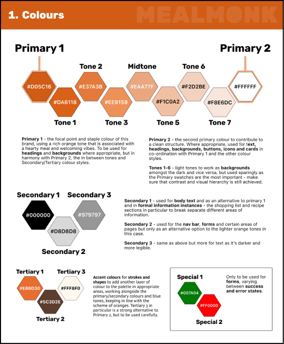
COLOURS
The theme for the colour scheme was homely, warming, welcoming and associated with food. Orange stuck out as a clear choice for us, associated with sweet and savoury products as well as on the colour psychology side, representing elements such as the sun, giving that warming sensation that we aimed to give to the users. With this in mind, we had a look at Orange colour palettes, aiming to find a rich enough orange to use as a primary colour style that would be perfectly legible in different forms rather than too bright or too dull, and once we found the perfect tone, I created a monochromatic sequence of tints up to white, which I made the second primary colour style, and all tones in between have been labelled by their style names and their hex codes, as well as the intended use for all tones. The secondary colour styles I wanted to be entirely neutral, using black and two grey shades and labelling their intended uses. Finally, I created an alternative brighter orange, a rich dark brown and a soft cream colour to use as tertiary colours, making solid alternatives to the primary colour styles and neutral colours to be used where appropriate, as these provide another layer to the colour palette while still tying together. I ended this screen with the two colours to be used specifically for form input states and labelled them as such.
TYPOGRAPHY
Fitting in with the vibe we wanted to give with MealMonk, we assessed potential choices of typeface families, taking into account what would work for the logo, headings, subheadings and copy text. Rubik stood out as a favourite for the logo in its extra bold form as a down-to-earth, bold typeface that fit the mould. Outside of its ExtraBold form, we discovered that it worked as a heading typeface too, remaining perfectly legible when reduced in size. For the copy text, SF Pro works in harmony with the character style of Rubik while being that bit more on the informative side, which is why it was selected for this purpose. Text styles had been created and defined by the style name, size and weight for each, as well as their intended use.

BUTTONS
All buttons used in the wireframes had been taken forward to the design system, where I used the colour and text styles to refine the base structure of all elements, before creating different states, using secondary and tertiary colour styles to differ the variants to one another before defining them by their size to scale and their intended use.

ICONS
I took all of the icons I included in each wireframe screen, created them as components and categorised into their main appropriate uses in different scaled sizes so that they can be included from the Assets panel and switched where appropriate.
CARDS
The cards which I had created on my wireframes which have been stylised with text and colour appropriately to differentiate between one another, also with the dimensions so that it is clear which cards are meant to fill the colour structure exactly. Some cards use drop shadows to represent an element of completion or action on the same page as simile cards which do not have the same style applied.

INPUTS
Forms have been created and defined in different states, varying between the default forms, success and error. These apply to the information forms which the user would need specific information to complete the process properly, while the search bar forms are only have default and filled states to signify completion.
GRIDS
I defined the grid system for the device, which is simple as it is only designed for mobile, leaving enough space in the margins and gutters for breathing space. The 4 column structure for mobile would easily scale up to an 8 column structure for a tablet app if the possibility became a reality.
by Doug


SCREENS
Dashboard (Logged Out)
by Nelia

Log In

Password Recovery

Recovery Confirmation
Create Account

Account Confirmation

Household

Pantry Search Results
Pantry

Pantry Category

Dashboard (Logged In)
Pantry Item


Create Recipe
Recipes

Recipes Search Results

Individual Recipe
Recipe Database


Shopping List

Diary

My contribution focused on shaping the product’s brand identity, visual direction, and final screen design - with the goal of creating a user-centred experience that communicates warmth, simplicity and ease for busy families and individuals.
I named the app MealMonk to reflect the core user problem: reducing friction around mealtimes for busy families and individuals. Guided by insights about busy families and individual needs, I aimed for a brand tone and name that communicates calm, simplicity and relief, while still being memorable - qualities that directly support the app's goal of making everyday tasks feel more manageable.
Working from the team's agreed direction of orange, creams and black, I developed a full colour system built around warm oranges, creams, soft blacks and dark chocolate browns. The palette was grounded in colour psychology — orange stimulates appetite and energy, while brown provides a grounding, stabilising quality that balances the vibrancy of the orange tones. These colours also aligned with my initial thinking for the name, as these warm earthy tones are often associated with monks.
I came up with the idea of integrating Trolley.co.uk within the shopping list — a price comparison website that compares real-time grocery pricing across major UK supermarkets including Asda, Tesco, Morrisons, Iceland, the Co-op, Waitrose, Ocado and B&M. This directly addressed the project objective of helping users shop smarter and manage their budget — a core need identified for the primary target audience of busy families. I initially thought about it as an integration, it ended up shaping the idea to put the cheapest product option first on the shopping list, which turned out much better, giving users immediate visibility of the best value choice without any additional effort.
For the logo font I chose Rubik One, a single-weight display typeface chosen for its bold, rounded letterforms that feel approachable. Its chunkiness complements Mo’s face - our monk mascot and AI assistant - and gives the brand a strong, memorable presence that is instantly recognisable.
The original MealMonk logo concept - a stacked wordmark with Mo's face replacing the O in MONK — was created by Cyril. I refined and developed this into the final brand asset, recreating it in Rubik One and producing both a stacked and horizontal version to give the logo flexibility across different screen contexts and usages.
In translating the wireframes into mockups, I made a decision to keep the all but one background white for clarity, focus on content, readability and cognitive ease — reserving colour for key moments such as the confirmation page, where a warm branded background reinforces the sense of welcome and completion. This was an intentional visual hierarchy choice.
Imagery was selected to reflect an organised, well-stocked kitchen, directly mirroring the user's mental mode when managing their pantry inventory. For example, the shopping list images uses clean white backgrounds to maximise scanability, keeping the user's focus on the product image, name, price and quantity - a deliberate choice for time-poor or mentally overloaded users who need information quickly, clearly and at a glance, while the pantry category page uses a more varied mix of imagery to clearly differentiate food groups and item types.
As an additional exploration, I designed a Google Play Store listing mockup to demonstrate how MealMonk would present itself at the first point of user discovery — translating the brand identity into a real-world product along with Cyril’s user research & analysis informed copy in the ‘About this app’ section.
Overall, my work contributed to the product’s brand identity, colour palette, logo typography, logo refinement and final screen designs - translating the product concept into a visually consistent, user-centred experience grounded in the needs of the target audience.

